Загрузка видео...
Не удалось загрузить видео
10:00 a.m. PT on Tuesday
186,022 просмотров • 2 лет назад •via X (Twitter)
Комментарии: 8

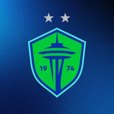
We’re definitely getting a new shade of blue.

I'm not against the change, as long as it's done exceptionally well and considering that the current logo is one of the best in the league. So please don't let it be a bad rebrand like Chicago's first rebrand

BRING US AN ORCA

Why change something that’s not broke?

why would we change our logo its good enough already😞

But if you change something, I’m gonna have to go and buy new stuff and…oh, it’s a money grab. Got it.

I’m excited it looks like it will be a combo of: 1. Space needle 2. Mountains 3. Water (hopefully with the orca) Looks like a different shade of blue, too. And maybe same with green?

Anything as long as there is no stupid orca.