Loading video...
Video Failed to Load
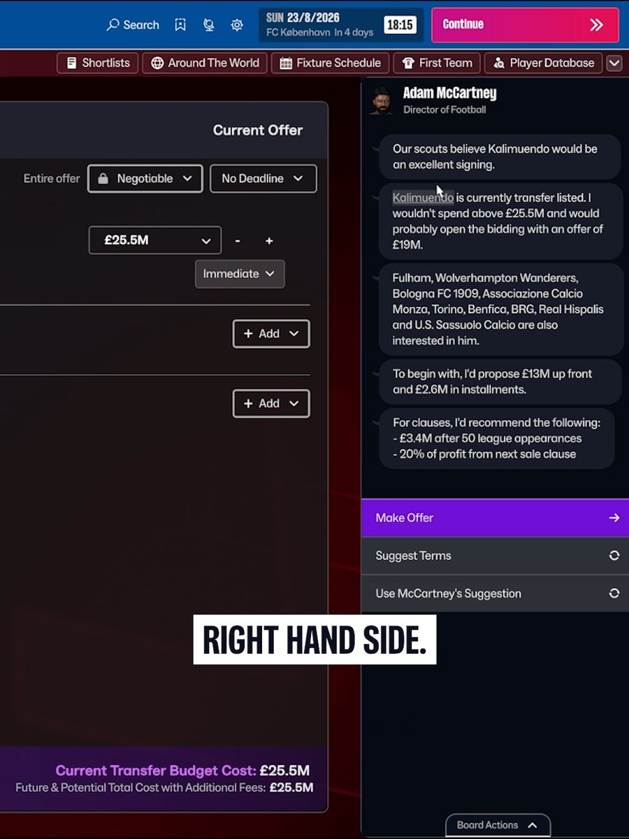
A clearer, more intuitive experience 🖱️ Let us take you through FM27's evolved interface and how we're making your game world easier to navigate in fewer clicks. Watch our first #FM27 deep dive 🎥👇

2,854,289 views • 1 month ago •via X (Twitter)
32 Comments

AM and Striker names phasing through each other in your TRAILER 🥀

Looks like an improvement on FM26. A lot of quality of life improvements 👍

Miles better than 26, add back in cup draws, deadline day and make it an option for the menu to be a sidebar and we’re so back.

@callumLtfc In the loan offers would add which league is in. It’s really annoying having to click into each one to figure it out.

Fm24 was the greatest game ever. Feel like they’ve lost it now and won’t get it back! Adding back simple views and features that were there in 24 but making it look shocking? Just looks like a shit console version

Screenshot of fm29 when you've finally fixed the game again

A massive improvement already!

Will cup draws and deadline day be brought back?

I don’t get it, they had one job with the UI and it was to make it not look like 26, it still looks the exact same even if navigating it is different or easier. It’s just an eyesore to look at. So disappointing every year

I will stick with fm24 till u guys produce something decent again. Keep working.

So basically gone back to the old interface

I hope that just like in FM24, we'll be able to exit during a match and access other player profiles or the other things again

So, what you’ve done is gone back to FM24 without going back to FM24? You’re showing off things that were never broken initially. Horrendous - not even one to be negative, but coming off FM26, this is your first deep dive and impression to your players. Shambles.

“We’ve given you a skin for the price of an entire game!

looks so much better

FM 24 - UI FM 26 - match engine graphics 26/27 player and staff updates. Combine those 3 and you got a good game.

Problema: UI Solução: Repetir a mesma merda de UI mas "com algumas correções" Essa UI É UM LIXO Próximo passo é mudar o nome pra EA FM 27.

LETS GOOOO! New Game Cycle FRESH START! Showing us the GAME first... MASSIVE Win!

is it fm26 or fm27 i can't understand bcs THERE IS NO FCKING DIFFERENCE

People need to understand that this UI was part of the change and part of a big step forward, The UI wont change, this already looks like a massive improvement on 26, hopefully we get cup draws back and deadline day too🤞

You’re cooking omds. Please let the tactical side/engine be insane🙌🏼

First news about the game is a lot of screens and no lengthy blog post. Less clicks, more customisation of screens. WIN WIN!

Please let me change how the attributes look. This blocky design is very offputting. :(

Fair play still looks shit

👏👏👏 Thanks for listening to the community! After two years of L's a big big W.

26’s UI was absolute shit, this looks like a good improvement but there was absolutely no need to move away from 24’s UI, not a single person ever complained about how that layout played, just creating issues for yourselves Hopefully this is a serious improvement on 26

Idc if there’s bugs personally. The biggest issue with FM 26 was that it wasn’t fun to play. A better looking fm 24 with 1-2 new features and I’m sold.

Please stop the cap! Everyone asked for FM24 UI or similar. You literally ignored everyone! I always loved FM but man you lot are super tone deaf. Just my opinion. I pray this game proves me wrong.

So basically it's back to FM24 with updated leagues and squads, nice work!

for long time players, the attributes for center-forward, midfield, and defensive positions used to be instantly recognizable at a glance; however, the introduction of the new "set pieces" display has eliminated that convenience. I’m sorry to say, but unless these kinds of small yet useful features are brought back, this game is doomed to fail.

fm26 1.0 that's a skip for me chief.

Now this looks awesome!