Video wird geladen...
Video konnte nicht geladen werden
An icon reimagined.
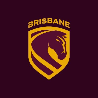
38,661 Aufrufe • vor 11 Monaten •via X (Twitter)
33 Kommentare

3 minutes on Chat GPT and I’ve come up with a much better one. Who should I send the bill to @brisbanebroncos ?? #letstrot

Call me a hater - new logo looks like generic AI slop, the old logo was so distinctive yet still modern. Why change it at all especially after you won a premiership?

Rebranding right after a premiership is wild

This looks like you guys have turned into a chess club

This is awful! Nothing wrong with the previous one 🤦🏻♂️

Everyone knows you dont care what he did, but doubling down and putting the whole street into your logo is wild 😳

This would have been an icon reimagined. What you landed on is a Temu soccer logo.

HAHAHAHA! Brisbane supporters were laughing at the new Dogs logo hahaha.

Interesting stuff Probably the one flaw re this club is the lack of a true iconic jersey. I understand this constant change to logos & kits to a degree, however, despite the rich history, there's nothing consistently traditional there

@LeagueScenePod Wow that is so bad.

Hmm, went from arguably the best looking logo in the comp, to the worst. Why? U dont see Maccas changing their golden M's, because "new era".

Worst logo in the comp

I like it!

this is ass

So a logo without the word Broncos… well done! Which marketing team did this, the same one as Jaguar or Bud Lite? What a shit logo!

LOL. I’ve worked in the Digital Design industry for 12 years - This is a TAX write off 😂 🇦🇺 Remember the Centrelink logo costing - $4.6 MILLION? 💰 Broncos already planned it after the financial year not realising they would win a comp. It’s claimed as operational expense 😉

The new logo is sooooooo bad! wtf where they thinking

Looks like fuckin shit

Just looks 'rubbery'. Like Loti suggested it doesn't show any strength or power. A rethink is needed 🤔

If it ain’t broke don’t fix it

Rubbish, I am sorry but this is some woke shit. Go down that path and you lose your base. Did you even test this with some of the supporter base? You should have put your best two or three options to the supporters to choose from. Lost chance.

Yuck

Looks terrible.

PONY 🐴

BRISBANE EQUESTRIAN

Whoever made that logo deserves a smack that is atrocious and even more the fact someone approved it 😆😆

Note to all NRL teams: Stop “reimagining”
It too them 18 months to come up with this and how much did it cost? Why change logo after they win the comp? And it looks feminine rugby league is supposed to be a masculine sport

If it ain’t broke don’t fix it

I don’t think this is it lads 🤣😭

Soo is the plan to merge with the dolphins to compete a name? The Brisbane Dolphins!

Please revert to the old logo

All that money and things the nrl gifts you and thats the best you can do 🤡


