Video yükleniyor...
Video Yüklenemedi
Carolina Hurricanes logo redesign🌀 #stanleycup

483,842 görüntüleme • 3 ay önce •via X (Twitter)
36 Yorum

No disrespect. The resign off the actual hurricane might be the worst things I’ve ever seen. Looks like a generic tech jersey. The “Canes” one not bad though.

I do like the look you created! I do have to say though I think the stick with flags is one of the best designs in all of sports. Especially with the small nod to NC in the design.

I knew I’ve seen that logo before…

Nice. >sigh< that whalers logo is possibly the best in sports...

I love that logo too!! I tried my best to somewhat incorporate its characteristics with the negative space, but I wish they’d just go back to the Whalers branding💚💙
The "C" and the "H" in yours is very nice. Much better than current!

Could have just stopped riiiiight about here…

This is what I got. Poor whales!

Like this but with “Carolina” across the crossbar of the H?

Love your work, remain a huge fan... but the Whalers logo is off limits. The greatest logo ever created in the history of ever, cannot be touched or combined. You can do any other team... but the Whalers... untouchable. Sacred. 😅

Why would a team that just make the Stanley Cup playoffs even remotely think of changing their logo? That's what teams with years of losing records do.
It’s a conceptual design - just for fun😊

The logo kinda looks like the Lethbridge Hurricanes logo.

Personally, I want nothing to do with the Whalers. We’ve been accused of stealing their team and seems to be some bitterness. It’s OUR team now, new and improved. The spelled out Canes is pretty good though.

DO THE JAZZ

Alt logo makes me hungry for chicken

Doesn’t seem very hockey. More like sponsor logo.

This fucking sucks so bad. Why did you spend time doing this

Nice attempt. Reads a little too power tool-y to me. But I like where you tried to take this.

No update needed tbh

Absolutely the fuck not. That logo looks stupid. We do throwback jerseys for the whalers.

You typically do a good job but this one was bad. Canes wording looks like Raising Canes. And why would you incorporate a logo from when they played in a different city a long time ago?

Say wallahi bro say wallahi 😭

This ain’t it sorry

You usually kill it. But this one isn’t very good.

The Hurricanes are one of those logos that started bad and there’s not salvaging it no matter what the update.

That's awful

Embarrassed to admit I have never once clocked the negative space H in the Whalers logo

@ProLineMockups Needs a city redesign.

there is no better

Looks like shit don’t ever fucking do this again 👍🏻

Love the canes. But idk about this. Canes C looked almost looked like Cleveland Cavs C. Maybe a spinning whale tail in the circle though idk

Hartford doesn’t need to be referred to anymore in the logo. Plus, the Whalers original logo cannot be improved on in any way. It is perfection.

Please do a CFL team next! Season is beginning this week. How about last year Grey Cup Champions, Saskatchewan Roughriders!

These two don’t go together

We have the best logo. No change needed.
Benzer Videolar


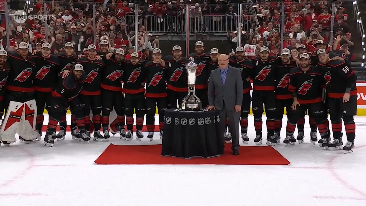
THE HURRICANES ARE THE EASTERN CONFERENCE CHAMPIONS!! 🌀 #STANLEYCUP
NHL
82,870 görüntüleme • 3 ay önce