正在加载视频...
视频加载失败
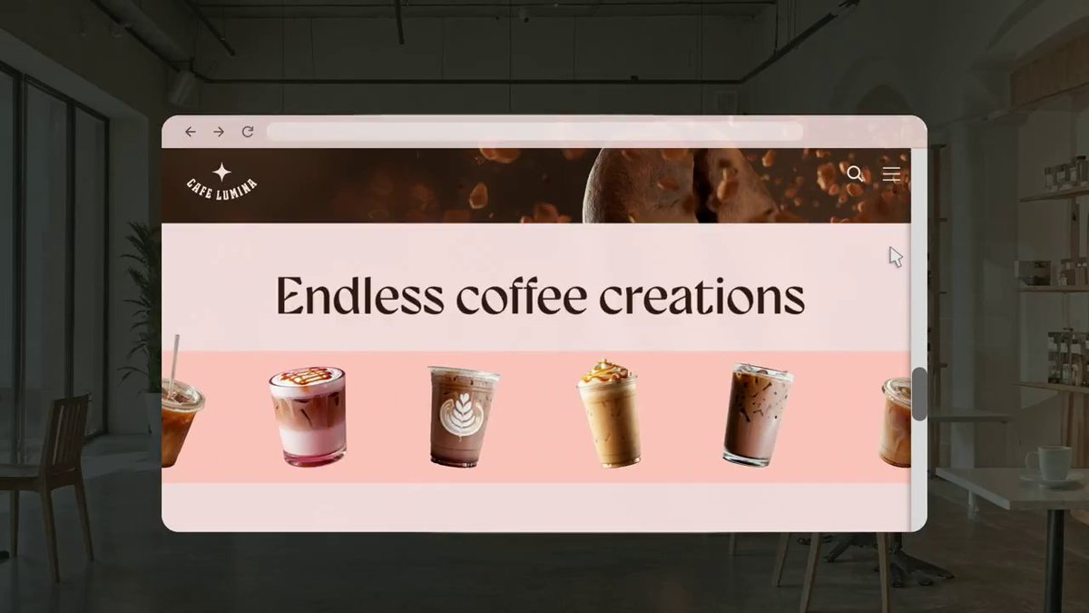
Could you achieve something similar with CSS? 🧑🍳 Scroll-driven animations && 3D perspective 🤝 The trick is driving the animation with list items that are smaller in height than the images (See the guides 👇)

9 条评论

Not that happy with it 💯 But the itch is scratched 😅 Onto the next demo! 🤙 Think WebGL gets you the smoothest result. Jus need to be mindful of readability for users etc.

This is so hot
The WebGL is undoubtedly smoother 💯 Would be interested to see how it's been applied though. If it's all canvas then you lose the readability 🤔 CSS has it's limits for sure with some of these. GSAP ScrollTrigger likely gets a not bad result.

Sheesh, that looks so good!

Sheesh, that lookis sg good!

Waiting for the awwwards people to come and start hating on this because you are stealing a design.

So cool! How did you break the images out of the list items? I did the same thing with this slider but hit some bugs when the list item was close to 100% the width of the container (not pictured)

wow, looks really good

X tabs looks like a p0rn website tabs 🤧🤦♂️ So .... Great & Amazing work 🙌


![CSS Trick! ⚡️ You can use scroll-driven animation with background-attachment to create a dynamic glowing card scroller without JS 🔥 section { animation:vibe; animation-timeline:--list; } @keyframes vibe { to{--hue:320;}} .glow {background: hsl(var(--hue) 80% 50%);} Here's how! 🤙 You can use the background-attachment trick used in other glow card demos 😎 article { background-attachment: fixed; } The difference here is that you aren't going to update the fixed background position with your pointer this time. It can remain fixed. The magic part is that as you scroll, the background will leave the card that's leaving and enter the card that's entering ✨ For the extra background glow, you can use a fixed pseudo element on the list container itself 💪 Once that's in place, you're only task is to change the color of the background as you scroll 🤔 Create a custom property declaration for the --hue @property --base { inherits: true; syntax: ' '; initial-value: 0; } Then create an animation that updates this value @keyframes accent { to { --hue: 320; }} The last piece is hooking it up to scroll and there is a little trick in here 👀 First, you need an inline scroll-timeline on the list ul { scroll-timeline: --list inline; } Then you can use timeline-scope to hoist that scroll-timeline up so a parent can use it. You then animate the custom property on this element and let the value cascade down to the places that need it 🔥 section { timeline-scope: --list; animation: accent both linear; animation-timeline: --list; } For example, the glow uses the --hue this way [data-glow] { background-image: radial-gradient( 150px 150px at 50% 50%, hsl(var(--hue) 100% 70% / 0.25), transparent ); } Lastly, scroll-snap is optional of course but plays nice with the scroll-driven animation demos ✨ The key for that is ul { scroll-snap-type: x mandatory; } li { scroll-snap-align: center; } That's it! Pretty fun trick to play with! 🤓 Any questions, let me know! Should we add it to the video walkthrough list? CodePen.IO link below! 👇](https://image.24vids.com/tw-1738039148672426164/ext_tw_video_thumb/1738032359302156288/pu/img/s8BufTPl8FRWOouG.jpg)
