Video yükleniyor...

Video Yüklenemedi

Ana Sayfaya Dön

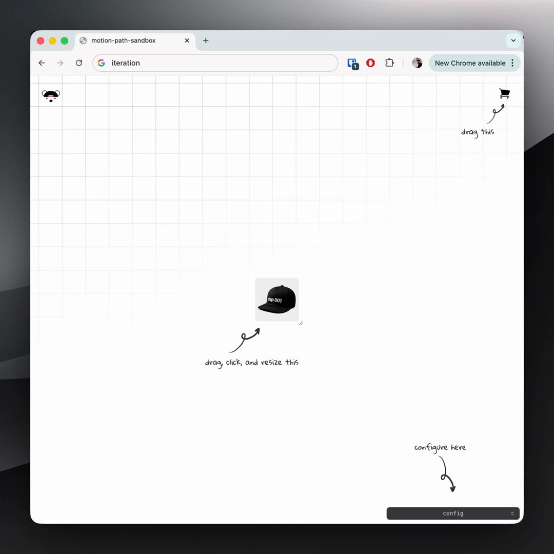
CSS logo marquee 1. bake the offset into your @​keyframes 2. set animation-delay based on duration + item count @​keyframes show { 0%, 73% { translate: -10px 30px; } 76%, 97% { translate: 0 0; } 100% { translate: 10px -30px; } } no need for JavaScript 🤙

75,216 görüntüleme • 1 yıl önce •via X (Twitter)

10 Yorum

jhey ▲🐻🎈 profil fotoğrafı
jhey ▲🐻🎈1 yıl önce

prompted by the logo marquee over on had to have a go at building a configurable one for myself with custom properties 🤓 the one over there doesn't overlap the same but love the aberration effect 👏

eSignatures.com profil fotoğrafı
eSignatures.com1 yıl önce

Add secure, embedded signing to your WordPress site in seconds. Try now!

Sulamita Ivanov profil fotoğrafı
Sulamita Ivanov1 yıl önce

It’s like you have an infinite amount of ideas. This is so cool!

jhey ▲🐻🎈 profil fotoğrafı
jhey ▲🐻🎈1 yıl önce

this one had been buggin' me then saw a marquee effect elsewhere and thought "that's it, have to build one my way" 😅

Ali Heib profil fotoğrafı
Ali Heib1 yıl önce

Nice trick! Make sure to use transform for better performance. Keep rocking those animations!

jhey ▲🐻🎈 profil fotoğrafı
jhey ▲🐻🎈1 yıl önce

you know individual transform properties (translate, rotate, scale) are composited, right? might be worth checkin' this DevTools feature out 🤙

Henry Gillis profil fotoğrafı
Henry Gillis1 yıl önce

Thanks for sharing these tips! Really helpful

Jassi Singh profil fotoğrafı
Jassi Singh1 yıl önce

Bruhh, I was looking for something like this. Thanks 🫂

The Teleporter profil fotoğrafı
The Teleporter1 yıl önce

Nice

Reuben Tech 👨‍💻 profil fotoğrafı
Reuben Tech 👨‍💻1 yıl önce

Bro u are so good been stocked on ur page

Benzer Videolar

CSS Tip! 🎠 You can create a responsive infinite marquee animation with container queries and no duplicate items 🤙 li{ animation: slide; } @​keyframes slide { to { translate: 0% calc(var(--i) * -100%);}} The trick is animating the items, not the list 😎 More tricks 👇 To get this one working, you need to animate the items and not the list (Watch the video first?). Each item needs to know its row index (--i) in the list and the parent needs to know how many rows are in the list: ul { --count: 12; } li:nth-of-type(1), li:nth-of-type(2) { --i: 0; } li:nth-of-type(3), li:nth-of-type(4) { --i: 1; } Once you have that, translate each item based on its row index in the list li { translate: 0% calc((var(--count) - var(--i)) * 100%); } Now for the animation. The key here is that each row has an animation-delay calculated from its index (--i). That number is offset to make it negative so the animation start is offset ✨ ul { --duration: 10s; } li { --delay: calc((var(--duration) / var(--count)) * (var(--i) - 8)); animation: slide var(--duration) var(--delay) infinite linear; } Make sure to wrap that animation in: @​media (prefers-reduced-motion: no-preference) { ... } Lastly, the fun parts! 🤓 To create the "vignette" mask. Use a layered mask on the container 😷 .scene { --buff: 3rem; height: 100%; width: 100%; mask: linear-gradient(transparent, white var(--buff) calc(100% - var(--buff)), transparent), linear-gradient(90deg, transparent, white var(--buff) calc(100% - var(--buff)), transparent); mask-composite: intersect; } To create the 3D skewed effect, use a chained transform (Try toggling it in the demo ⚡️): .grid { transform: rotateX(20deg) rotateZ(-20deg) skewX(20deg); } As for the responsive part, use container queries! 🔥 article { container-type: inline-size; } When the article (card) is narrower than 400px update the grid and animation settings 🤙 Double the rows means double the duration! @​container (width < 400px) { .grid { --count: 12; grid-template-columns: 1fr; } li:nth-of-type(1) { --i: 0; } li:nth-of-type(2) { --i: 1; } li:nth-of-type(3) { --i: 2; } li:nth-of-type(4) { --i: 3; } li { --duration: 20s; } } CSS has the magic to be able to update those animations at runtime based on your custom property values 😎 An added bonus in this demo is that it doesn't require any JavaScript at all, for any of it 🤯 We can use CSS :has() for those toggles that update the styles, even the theme toggle! 🫶 Any questions, let me know! Make sure to check out the video. Will do a walkthrough one to follow-up 🤙 CodePen.IO link below! 👇

jhey ʕ•ᴥ•ʔ

541,845 görüntüleme • 2 yıl önce

Future CSS Tip! 🍏 You can create this Apple-style photo scroller by combining CSS scroll-driven animations and CSS scroll-snap 😍 Peep those changing captions 👀 No JS! img { animation: highlight both linear; animation-timeline: view(inline); 👈 Horizontal animation-range: cover 0% cover 50%; 👈 Finish } @ keyframes highlight { 50% { translate: 0 0; scale: var(--starting-scale); 👈 props opacity: var(--starting-opacity); 👈 } 100% { translate: 0 0; scale: 1; opacity: 1; } } Without the animation support, you get a standard unordered list containing some s 🤙 How do we swap the captions though? The "trick" is to use position: absolute on the figcaption and animate their opacity based on the ViewTimeline of their parent list item 😎 figcaption { animation: show both linear; animation-timeline: --list-item; } @ keyframes show { 0%, 45%, 55%, 100% { opacity: 0; } 50% { opacity: 1; } } li { view-timeline-name: --list-item; view-timeline-axis: inline; 👈 important! } The parent of the scroll track uses position: relative so all the captions sit in the middle even though they are in the right place for the markup 🙌 The last bit is the scroll-snap 🤙 Not much to it at all. Wrap the list and make it scrollable. Then add scroll-snap-type .wrapper { scroll-snap-type: x mandatory; overflow-x: scroll; } Then make sure each list item has scroll-snap-align set on it li { scroll-snap-align: center; } That's it! Pretty cool demo to put together and see how to do this stuff with these APIs 🤓 A lot of cool little tricks to pick up for writing your CSS! ⭐️ CodePen.IO link below! 👇

jhey ʕ•ᴥ•ʔ

232,131 görüntüleme • 2 yıl önce