正在加载视频...
视频加载失败
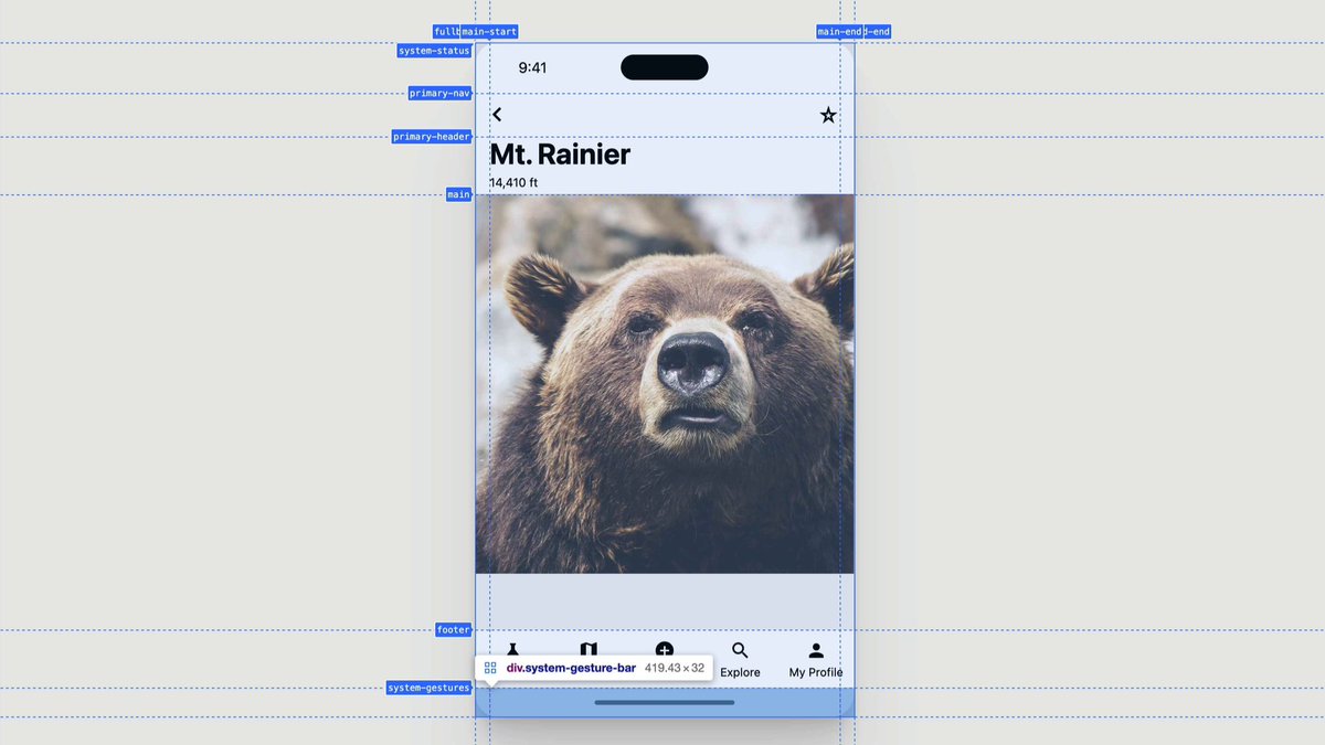
Future CSS Tip! 🔮 (This one's close 🤏) You can use "subgrid" to give child elements access to a parent's grid tracks 👀 This is great when you want to make sure content lines up 🙌 Check those cards 👇 article { grid-row: span 4; display: grid; grid-template-rows: subgrid;... show more

11 条评论

Here's that @CodePen link! 🚀 Available in Firefox, Safari, and Chrome 117+ 🤙 Now go forth and show off your CSS Grid superpowers. Keen to see what people come up with. Found it tricky to find use cases when I presented this last year 🤓

That is really very interseting trick! But lets wait untill it become fully supported ⚠️
P.s I know these cards are ugly 😅

Seem so simple. Does it automatically work out the best heights for each row?
Yeah, the "magic" of implicit grid tracks at play there and working it out off the parent layout 😍 I had to present it at the back end of last year and was hunting around for ways to make use of it 😅

@Alejo_Gamboa

I *really* needed this a few months ago. Found subgrid, then cried when I saw the browser support. Ended up with Javascript workaround. Guess I'll revisit in a few months if it's imminent.

This is one of the few use cases that I really use grid
For cards? I find myself often jus' kinda fluidly switching between flex and grid as and when it feels right which is a weird thing to do I guess 😅

This is one of the use-cases for sub-grid Rachel Andrew wrote about yonks ago. It’s great.
It's nice to finally see it coming into all the browsers. There was a little inconsistency still when I presented it last year. Looks like that is getting ironed out 🙌 Could you think of any other interesting layout use cases?
相关视频

![CSS sidebar tricks 🤌 transition expanded menu items to "auto" height using grid li > div[inert] { grid-template-rows: 0fr; } li > div { grid-template-rows: 1fr; transition: grid-template-rows .3s; }](https://image.24vids.com/tw-1894137189161689482/ext_tw_video_thumb/1894122269661601792/pu/img/2mDQigxDcMHyffmN.jpg)


![Future UI && CSS Tip! 🔮 You could use View Transitions to animate CSS grid position and create an OSX-style exposé for a portfolio 🔥 It's a grid where things move based on state. Wrapped in a VT 🤙 [data-expose] section{ grid-area:var(--x)/var(--y); } CodePen.IO link below 👇](https://image.24vids.com/tw-1684294735228289026/ext_tw_video_thumb/1684293327405871106/pu/img/_8tGY2yw7r3sRTOo.jpg)
![a smoother radius transform version using css. no framer motion used here. for auto height transition using css `grid` inspired by jhey ʕ•ᴥ•ʔ. when collapsed `grid-rows-[0fr]` and expanded `grid-rows-[1fr]`. and that with `ease-out-cubic` with `300ms` makes it feel just perfect ~](https://image.24vids.com/tw-1983597292298104912/amplify_video_thumb/1983594304695390208/img/pd-NqUa50ZT1SOyA.jpg)


CSS Grid ( justify-content ) 🔥 ➼ The animated tutorial makes learning easier.
Alamin
46,145 次观看 • 3 年前