Загрузка видео...
Не удалось загрузить видео
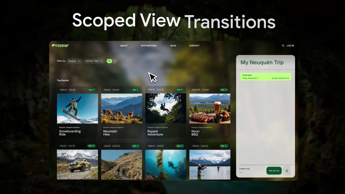
Future CSS && UI Tip! ⚡️ You could use View Transitions to create those word carousel-type effects 😍 span:nth-of-type(2) { view-transition-name: swap; } ::view-transition-old(swap) { animation-name: slide-down; } ::view-transition-new(swap) { animation-name: slide-up; } How To 1. Create a paragraph split into spans 2. Set an interval in JavaScript that... show more

230,052 просмотров • 2 лет назад •via X (Twitter)
Комментарии: 9

Here's that @CodePen link! 🚀 Remember. This will only work in Chromium at the moment 🤓
And here's the @ChromiumDev issue that got raised from making this demo 🤙 (Fix rolling out into Chrome) Another example of why making random demos can help the <web platform/> 💯 Make things. Raise bugs. Share stuff! 🤓

Safari be like

Just made exactly this, this afternoon 🔥

This is nice. I used to do this in js. I’m always inclined to css solution before get to javascript. Bookmarked

It doesn't render properly on my version of Chrome. When it slides in, all of the words are too small, and then after a delay they size back up to the correct height!
Yep – I'm not sure it's quite rolled out to everyone on Chrome yet. It should work as expected in Canary. Look out for that Chrome update 🤙

amazing 👏

@SaveToNotion


![Future UI && CSS Tip! 🔮 You could use View Transitions to animate CSS grid position and create an OSX-style exposé for a portfolio 🔥 It's a grid where things move based on state. Wrapped in a VT 🤙 [data-expose] section{ grid-area:var(--x)/var(--y); } CodePen.IO link below 👇](https://image.24vids.com/tw-1684294735228289026/ext_tw_video_thumb/1684293327405871106/pu/img/_8tGY2yw7r3sRTOo.jpg)


![Future CSS Tip! 🔮 You could combine anchor positioning + :has to create this kinda iPad style follow effect ✨ [href=blog]{anchor-name:--bl;} :root:has([href=blog]:hover){--a: --bl;} .cursor{left:anchor(var(--a) left);} You can transition anchors! 😎 CodePen.IO link below! 👇](https://image.24vids.com/tw-1636420648535769107/ext_tw_video_thumb/1636419242886152232/pu/img/fu92DyOAZ6bLZ3qp.jpg)


![CSS Tip! 🚥 You can create these trending expanding scroll indicators with scroll-driven animations and flex 🤙 .indicator { animation: grow; animation-range: contain calc(50% - var(--size)...; animation-timeline: var(--card); } @keyframes grow { 50% { flex: 3; }} What's the trick? Put the indicators in a container using flex layout and set a width larger than the number of indicators 😉 .indicators { aspect-ratio: 7 / 1; display: flex; } Importantly, set no gap 🤏 To mimic the gap set a transparent border on each indicator and set the background using padding-box .indicator { background: linear-gradient(#fff, #fff) padding-box; border-radius: 50px; border: 4px solid transparent; } Now for the animation. You want to create a view-timeline for each card that moves across 🤙 li:nth-of-type(1) { view-timeline: --one inline; } li:nth-of-type(2) { view-timeline: --two inline; } Make sure they use the inline axis too! The trick is hoisting these view-timeline so the indicators can use them with timeline-scope 👀 .track { timeline-scope: --one, --two, ...; } All that's left is for you to create the animation piece using some calc with the card size ⚡️ .indicator { --size: calc(var(--card-width) * 0.9); animation: grow both linear; animation-range: contain calc(50% - var(--size)) contain calc(50% + var(--size)); } .indicator:nth-of-type(1) { animation-timeline: --one; } .indicator:nth-of-type(2) { animation-timeline: --two; } @keyframes grow { 50% { flex: 3; }} And there you have it, responsive scroll indicators using CSS scroll-driven animations 😎 Sprinkle a little JavaScript to make them clickable and scroll the the right card ✨ const shift = (event) => { if (event.target.tagName === "BUTTON") { const index = [...event.target.parentNode.children].indexOf(event.target); const item = document.querySelector(`li:nth-of-type(${index + 1})`); item.scrollIntoView({ behavior: "smooth", inline: "center" }); } }; As always, any questions or suggestions, let me know. I've put a JavaScript fallback in to use GSAP in browsers that don't have scroll-driven animations 🫶 CodePen.IO link below! 👇](https://image.24vids.com/tw-1743737760773705824/ext_tw_video_thumb/1743734045748641792/pu/img/nFQ1z9S-iN4AY8SN.jpg)


