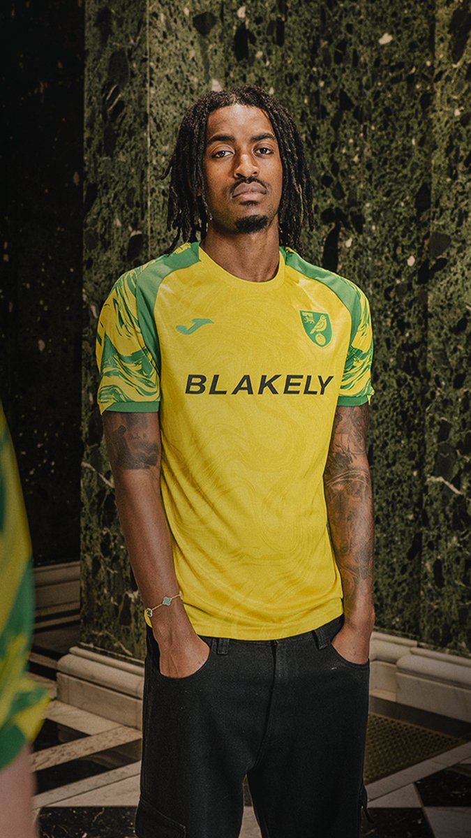
Hidden in plain sight 🪡

@NorwichCityFC827K followers
235,329 views
33 Comments
Comments from the original post on X (Twitter)

@ncfc_knight
Have they just inverted the colours of the training top from two seasons ago?
9 likes

@ColinPep1
Hmmm bit training shirt like but that’s the issue when clubs are having to come up with new designs every season. Bring back two year cycles for better designs and so kits have the chance to be remembered.
9 likes

@YellowsInsider
This isn’t the away kit admin
6 likes

@Norwichlad1
Basically the same as the first Joma kit? 😐
5 likes

@tylercr05
Does Jovon Makama come with it?
5 likes

@jadorelememes
Meh. Sleeves look messy but likely a grower. Not desperate for one put it that way...
5 likes

@thecanaryjerry
@NorwichCityWFC I like that. Yes I like it a lot.
3 likes

@humanmale1984
Let’s have a white away shirt with the same green sleeve design as well
3 likes

@dianencfcfan
That looks like the inside of what i still call the Norwich Union building on Surrey St with the marbled pillars
3 likes

@Shaney_ncfc
That looks lush
3 likes

@stevnews
Hidden in plain site
3 likes

@TravelsFooty
Looks shit
2 likes

@RuaidhriCummins
It's different. Not sure I love it but it could grow on me
2 likes

@norwichjamie
@g1902o 🔥🔥🔥🔥🔥🔥🔥🔥🔥🔥🔥🔥🔥🔥🔥🔥🔥🔥🔥🔥🔥🔥🔥🔥🔥🔥🔥🔥🔥🔥🔥🔥🔥🔥🔥🔥🔥🔥🔥🔥🔥🍆
2 likes

@Onel_Mourner
It’s definitely a shirt
2 likes

@Cartoonjoker12
Awful
2 likes

@CallumBatson
The jury is out on this one for me at the moment. I feel it would have looked better if the sleeves didn't have the yellow
1 like

@waynebar07
Oh yes!! OTBC 💛💚
1 like

@Jackorooney1
Kinda like it, but not the biggest fan. Growing on me the more I see it. If they didnt change the Blakely logo it would look lovely. Either way can see us doing well wearing it
1 like

@Mark39082226
This one might be a grower. I don't love it, but I don't hate it.
1 like


