正在加载视频...
视频加载失败
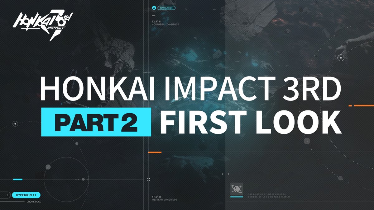
Honkai will get a new UI update for Part 2

10 条评论

Functionally better, aesthetically worse. I ain't digging the "characters standing on the void" thing they've been doing with all their games since Genshin. I'd rather see my characters standing in the bridge. It brought a lot more color to the screen.

Maybe it's looks more like other generic gacha game UI, but I guess it more new-user friendly. A lot of new people were thrown off by older UI because it's confusing. Let's see how it will turn out.

ewewewewewew looks like shit what the fuck

the background kinda plain tho 🤷

Eh, it’s lost a lot of the charm of the old UI. But honestly it’s for the best because the amount of people I know who can’t get into the game partly because of how cluttered it’s UI is right now…

actually i think it looks good. I will miss the classic UI, but this looks more premium imo

hoping they still add the option to change the background... this is way too bland

The UI looks good,and it's not confusing for new players. Old players need to shut up and stop complaining for once in a while

As a certified old man of the game, it's not that bad. I can definitely still see the HI3 in it. Then again I was there back when they still had the sliding cards for the stages selection. So this is like the 2nd time of UI changes for me.

Damnnn It looks so odd like that So used to the current one


![[5/14 Update Info!] The in-game UI is getting a massive overhaul! Speeds are also being optimized! Get excited for the update! #DBLegends #DragonBall](https://image.24vids.com/tw-1922215630427812009/amplify_video_thumb/1922212488676085760/img/IUAoOpFihHuZyOg0.jpg)


