Video wird geladen...
Video konnte nicht geladen werden
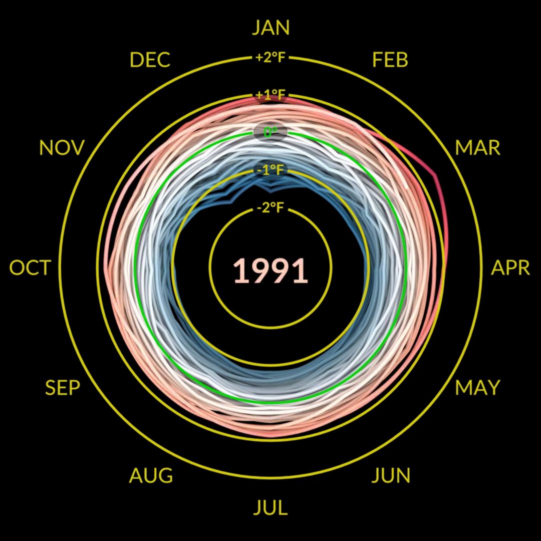
I periodically post this visualization reminder as summer approaches in the Northern Hemisphere - think heatwaves 🫠 The changing distribution of land temperature anomalies since 1950... Animation is by NASA's Scientific Visualization Studio using GISTEMPv4 data. More information at

98,149 Aufrufe • vor 3 Jahren •via X (Twitter)
11 Kommentare

@NASAViz Not only is the global average temperature rising each year, but also the temperature variability is also increasing. It indicates that extreme temperature events are happening more frequently.

Do you have the right weather app for this season?

@NASAViz Now show the temperatures that weren’t taken at airports or othef heat generating tarmacs or buildings.

@EC_Kosters @NASAViz Great visualisation!

@NASAViz the global climate has become warmer and more comfortable

@NASAViz What are the axises?

@NASAViz The PDFs are derived from a kernal density estimator ( with the x-axis as the temperature anomaly relative to a 1951-1980 baseline (

@NASAViz It would be more helpful to see this further back than 1951. Where does the data come from and what is it measuring?

@NASAViz Nice visual! I find it really interesting that the distribution has widened so much. It means we can still get extreme cold but more seldom. But in the hot end, it´s much higher, witch means it's asymetrical. I'm not sure I can think of an obvious explanation to this, can you?
@NASAViz In addition to resulting from differences in the spatial distribution in the rate of warming patterns, here is some more information on the statistical appearance:

@NASAViz Does anyone else see a pattern here or am I the only one. Al Gore is a profiteer


![Interactive 3D space-time model visualization with data/state-information propagation as affected by 'gravitational fields', where the apparent or measured rate of activity/change of state(s) is [relatively] slower in regions pinned by high-mass objects (planets, stars...).](https://image.24vids.com/tw-2002333120251531361/amplify_video_thumb/2002331412934873088/img/0hK_kZERpk2tiFl6.jpg)


