正在加载视频...
视频加载失败
It's 2024, CSS has custom timing functions for your animations and transitions ✨ transition: scale 0.5s var(--elastic-out); --elastic-out: linear( 0 0%, 1.11 8.49%, 1.37 12.94%, 1.36 14.48%, 1.31 16.20%, 0.94 24.01%, 0.86 27.84%, ... );

6 条评论

Can copy and paste them from this @CodePen 🤙 Should be good in Chrome, Safari, and Firefox 🏅 That's where the demo has been tried out

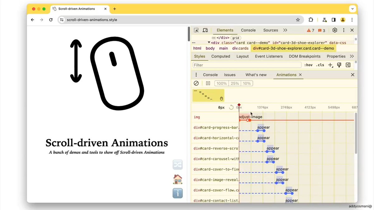
When I see these grids, the first things I think of are : - Robert Penner - ActionScript - Juicy UI Lot of fun

It’s 2024, and still not possible to blend two of those timing functions together despite me explaining to the W3C how to do it more than a decade ago

really cool! it works great for Chrome and Firefox but it felt less smooth for Safari 17.5 - at least in this example: Safari vs Chrome
Yeah, will definitely depend on the accuracy and rounding you go with when exporting 💯 Also, Safari has some quirks with starting-style I've found. Definitely a trial and error to get the right feel, etc. across the board ⭐️

Awesome. My question is: How do you come up with these values used in the timing functions? 😀


![CSS Tip! 🤙 You can create custom easings for your animations and transitions with linear() 🔥 :root { --bounce: linear(0, 0.39, 0.57, 0.52, ..., 1); } .digit { transition: translate 1s var(--bounce); } Perfect for adding character to animations like this MRR widget! 🫶 Some of the easing code is obfuscated in the snippet there 👆 You would likely write these custom eases once and then reuse them in your projects 🎬 For example, here's the CSS for an elastic ease 🎾 :root { --elastic: linear( 0, 0.0009 8.51%, -0.0047 19.22%, 0.0016 22.39%, 0.023 27.81%, 0.0237 30.08%, 0.0144 31.81%, -0.0051 33.48%, -0.1116 39.25%, -0.1181 40.59%, -0.1058 41.79%, -0.0455, 0.0701 45.34%, 0.9702 55.19%, 1.0696 56.97%, 1.0987 57.88%, 1.1146 58.82%, 1.1181 59.83%, 1.1092 60.95%, 1.0057 66.48%, 0.986 68.14%, 0.9765 69.84%, 0.9769 72.16%, 0.9984 77.61%, 1.0047 80.79%, 0.9991 91.48%, 1 ); } The idea is that you map a set of points between [0, 0] and [1, 1]. This is cool because you can convert something like an SVG path to these coordinates. Link below for a gist with some eases in 🤙 As for the MRR widget, the trick is to set out some number tracks and translate them to show the correct number 🧮 You can translate by line-height based on the value. And the original value you can convert to a currency string like $1,000,000.00 using JavaScript's Intl.NumberFormat() const formatter = new Intl.NumberFormat('en-US', { style: 'currency', currency: 'USD', }) formatter.format(1_000_000) Check out the exploding view and the video to see how it all works! 👀 CodePen.IO link below! 👇](https://image.24vids.com/tw-1735499859715584298/ext_tw_video_thumb/1735496613617926145/pu/img/K88_7XNeukK-81aQ.jpg)

![CSS Trick 🧲 You can create magnetic links with the power of custom properties and some JavaScript 💪 a { translate: calc(clamp(-1, var(--x), 1) * var(--pad-x)) ...; transition: translate var(--s, 1s) var(--ease, var(--elastic)); } a:hover { --s: 0s; } The trick here is to pad out the list items wrapping your links and use that as a translation limit 🛑 Start by using some JavaScript to calculate a value between -1 and 1 for both the x/y axis on pointermove for each list item, not the link! 🔗 If your pointer was at the center of the item, you'd get [0,0]. If it was in the top right, you'd get [1,-1] ☝️ It's worth checking out the JavaScript snippet to see how the mapping function works. Essentially, you create a function that when given a value between two bounds, will give you a mapped value back 🤙 const mapX = mapRange( item.offsetWidth * -0.5, item.offsetWidth * 0.5, 1, -1 ) Then, on pointermove, you plug the pointer position in to get the value back out and pass that into your CSS const x = mapX(item.centerX - event.x) document.documentElement.style.setProperty(--x, x) When the pointer leaves the list item, you make sure to reset these values back to 0 ✨ Once CSS has your values, it's the trick of updating the translation of each part You know that in each axis, you only want to translate the link by the padding amount li a { translate: calc(clamp(-1, var(--x), 1) * var(--pad-x)) calc(clamp(-1, var(--y), 1) * var(--pad-y)); transition: translate var(--speed, 1s) var(--ease, var(--elastic)); } This will translate the link within the list item by the desired amount. The cool part here is that you can set an offset for the text inside the link and have that move at a different rate ⭐️ By only updating the --pad-x/y custom properties for the inside the link, you can control how much it moves nav a span { --pad-x: 0.25rem; --pad-y: 0.25rem; } And the last piece, how do you update the behavior for transition speeds? And so it springs back like that? Again, use custom properties ✨ a:hover { --s: 0s; } a { transition: translate var(--s, 1s) var(--ease, var(--elastic)); } By default, a link will use --elastic easing via linear() and have a transition-duration of 1s. When a link is hovered that speed becomes 0s because you want the link to magnetise to your pointer. How about that little gap between when your pointer enters the item but hasn't hovered the link? Set a different transition so it transitions to being hovered 🫶 nav li:hover a { --ease: ease-out; --speed: 0.1s; } That's kinda it! 🙌 Use JavaScript (~40 loc) to get the information and then let CSS do all the lifting for you 💪 Any questions or suggestions, let me know 🙏 If you want a walkthrough video, also let me know please 🙏 CodePen.IO link below 👇](https://image.24vids.com/tw-1745716136824672271/ext_tw_video_thumb/1745612660081881088/pu/img/SsGz-uqmfdr1KZ7H.jpg)


