正在加载视频...
视频加载失败
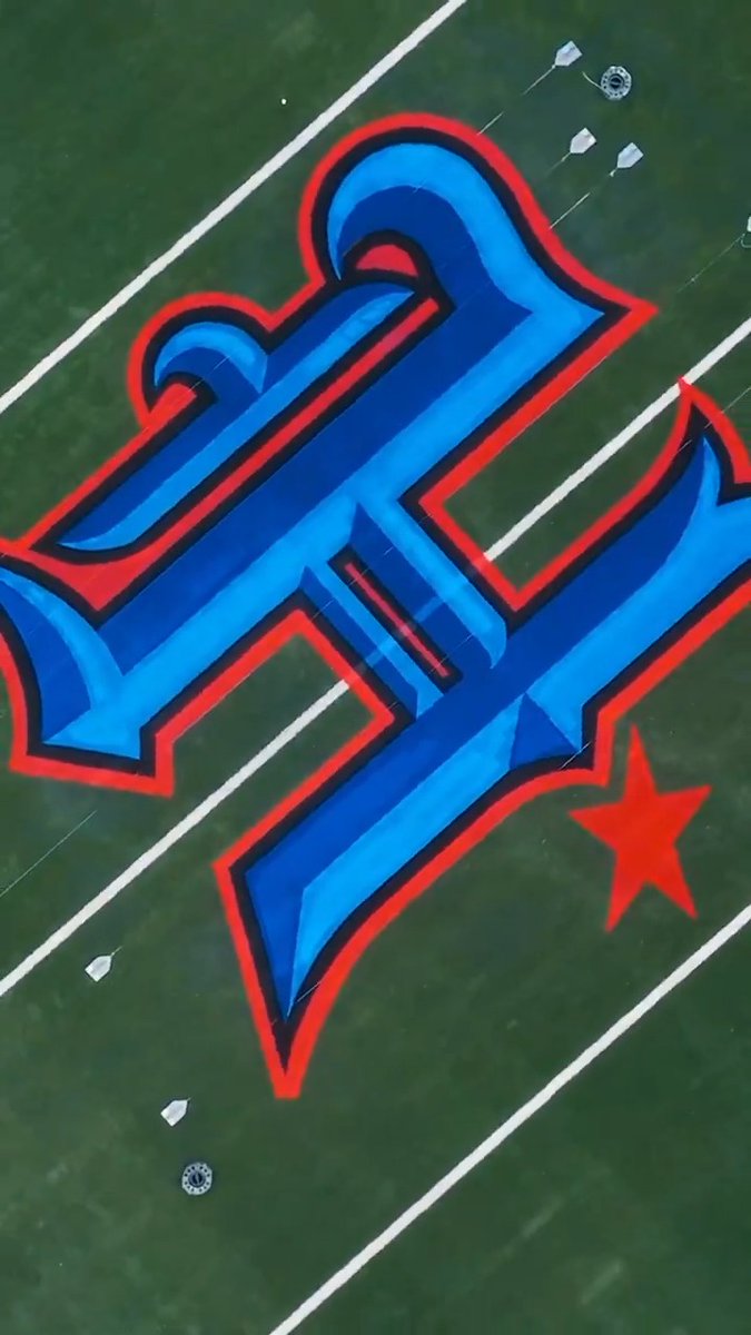
LOGO REVEALED 👀 Introducing the 2027 #MFinalFour logo.

454,654 次观看 • 10 个月前 •via X (Twitter)
34 条评论

lame af again, bring back the old styles

@MarchMadnessMBB Sadly they all look the same now.

@MarchMadnessMBB Final 4 logos have taken a sharp turn for the worse over the years

After a well put together montage showing all the character Detroit has to offer, you end it with a soulless corporate nothing burger logo? Still plenty of time to change it; you’ve shown with the video you know how to brand Detroit, now deliver with the logo.

Brutal. D+ grade. The final four logos used to be so fun and unique.

I am severely hurt & disappointed. That logo will NOT be going in my header.

🕊️🥀

All final four logos started going downhill since 2017, and started to become a copy and paste of the same logo with a different year, in a diamond or basic shape. please get rid of minimalism and go back to the old logos. Look at how great the old ones were

People get paid for that?

This is going to look great in Gainesville

My favorite, sans serif font on a basic shape background

EWWWWWWW

Tbh the Cracker Barrel people would have done better

Looks like shit

It’s bad

That fucken sucks🔥

If the logo requires its elements to be explained by a video, you made it wrong.

You couldn’t have made this less boring if you tried

Fucking repulsive. Fuck you @CharlieBakerMA

Yikes

What’s the deal with these homogenized logos??? Go back to unique logos

Lame as fuck

can yall stop being simple lol

A hexagon! Why didn’t I think of that!

This, much like modern-day architecture, is pale and grey

All this for a hexagon ???

The consultants you hired for this robbed you blind

Nobody wants this

They all looking the same now… very basic.

Buns

Worst one I've ever seen

Ts actually pmo a bit 'cause why does it look like next year's logo with different font. Remove the orange, add the light blue or sum.

Did they just use a Canva template?

Mid