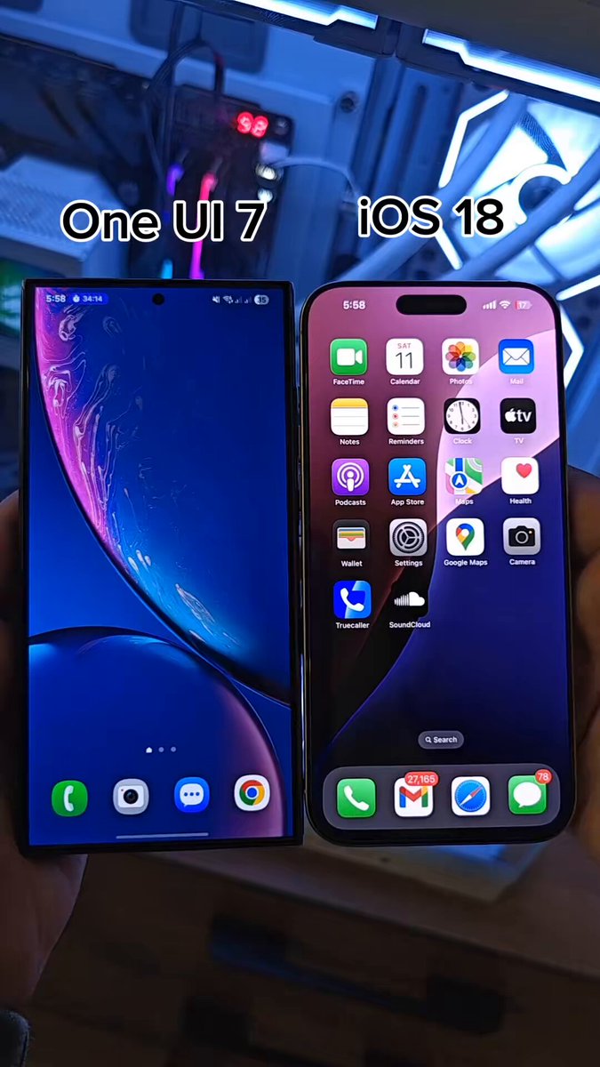
Loading video...
Video Failed to Load
New Charging animations and looks in One UI 7.

51,768 views • 1 year ago •via X (Twitter)
10 Comments

Marc1 year ago
I feel like a lot of One UI 7 changes are extremely random. I don’t see a cohesive design language for all the different UI elements and icons. Feels like change for change’s sake. The focus on smoothness is admirable but the redesign doesn’t do it for me at all.

Noah Cat1 year ago
bad

Joe Nuts1 year ago
yikes... why not add the wave effect from android?

asofficial ✨1 year ago
Hope this is just a beta think but the icon has very poor padding and alignment

TechTarva1 year ago
Old one was also look better!

RM Nazari1 year ago
The charging icon has been moved to the corners.

Vaibhav1 year ago
Worst we want watch oneui 6 charging animations that the goat

Aryan Singh1 year ago
This is 100 times better than the current one.

Edris1 year ago
🤮🤮🤮

Kittikorn Tatar1 year ago
Gay I want to see the fuck huge number not small ass pill