Загрузка видео...

Не удалось загрузить видео

На главную

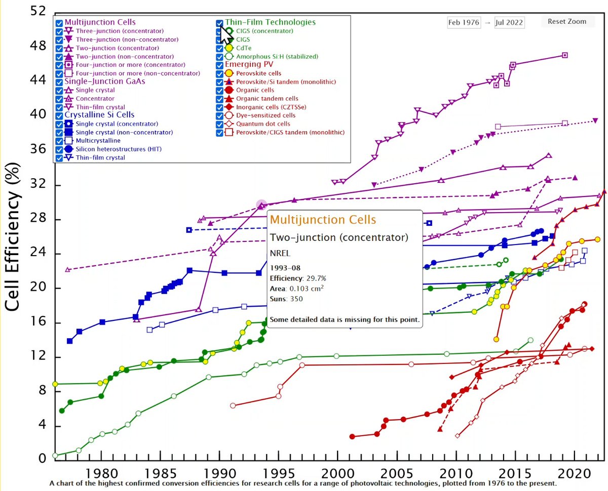
Online chart maker Graphy is a free chart-maker tool for slick, interactive data visualizations. You can use real data for your chart. All popular charts are supported (bar, line, pie, funnel, heatmap).

10,871 просмотров • 2 лет назад •via X (Twitter)

Комментарии: 0

Нет доступных комментариев

Здесь появятся комментарии из оригинального поста

Похожие видео

Consulting-level slides, mimicking the McKinsey-style layout. I used kimi slide's adaptive mode to create them (coding version, not image gen version) .All the content was powered by K2's coding capabilities, fully editable. My prompt: Analyze Global EV market opportunities. Requirement: A professional, high-density consulting presentation slide, designed in the style of a top-tier strategy firm (McKinsey/BCG) blended with high-end editorial aesthetics. Core Content & Layout: 1. Rich Data Visualization: The slide is populated with complex, precise charts (stacked bar charts, waterfall charts, or line graphs) and detailed data tables with rows and columns. 2. Structured Frameworks: Includes strategic diagrams or 2x2 matrices constructed with thin, clean lines. 3. High Information Density: The layout is sophisticated and multi-column, mimicking an actual business analysis deck, not just an empty cover page. Visual Style: 1. Aesthetic: Tech-minimalist but information-heavy. Clean, sharp, and authoritative. 2. Typography: Serif fonts (like Times New Roman) for the main headlines to give a premium financial report feel; clean Sans-serif for chart labels and data numbers. 3. Color Palette: Clean white background. Text is sharp black. Charts and graphical accents use Deep Royal Blue and distinct shades of grey for data hierarchy. 4. Graphics: Use fine hairline borders for tables and precise vector lines for graphs.

Crystal

253,448 просмотров • 6 месяцев назад