Video wird geladen...

Video konnte nicht geladen werden
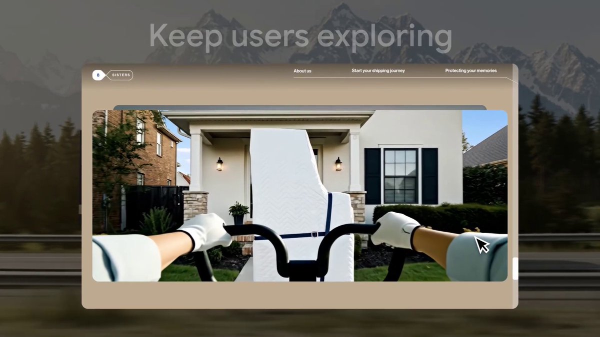
Zur Startseite

🖱 Scrub through a CSS @‍keyframe with an element's scroll position. What do you think of this effect? Is it OK when very subtle?

44,148 Aufrufe • vor 1 Jahr •via X (Twitter)

10 Kommentare

Profilbild von mert
mertvor 1 Jahr

great method! btw what's the tool that you're using at 0:57? it looks super useful.

Profilbild von Wes Bos
Wes Bosvor 1 Jahr

Scroll Driven Animations chrome dev tools plugin from @bramus - a must have when learning + debugging

Profilbild von Ravavyr
Ravavyrvor 1 Jahr

personally, this is just too much movement as i scroll

Profilbild von CRANQ
CRANQvor 1 Jahr

Looks pretty damn cool - Quite like an interactive website.

Profilbild von Matias Baldanza.dev 😁 ⚛️
Matias Baldanza.dev 😁 ⚛️vor 1 Jahr

Stop trying to bring back <marquee>. Not gonna happen. 😁 (jk aside, it's pretty cool, when used appropriately.)

Profilbild von Adam Leis
Adam Leisvor 1 Jahr

animation-timeline is one of my favorite modern CSS features ♥ that and custom props/variables Good info to have 👍

Profilbild von Marlon Stevenson
Marlon Stevensonvor 1 Jahr

I like these types of designs. Looks very slick.

Profilbild von Constantin 🔥
Constantin 🔥vor 1 Jahr

Very nice, but important to not overdo it throughout the page.

Profilbild von The Fianchetto
The Fianchettovor 1 Jahr

This is so cool! 😎

Profilbild von Daniel Schwarz
Daniel Schwarzvor 1 Jahr

Way too much movement

Ähnliche Videos

CSS Tip! 📜 You can use scroll-driven animations to progressively enhance collapsing a floating call to action 🤏 .cta { animation: shrink; animation-timeline: scroll(); animation-range: 0 100px; } @​keyframes shrink { to { width: 48px; } } That's the gist of it. Use the body scroll position with animation-timeline: scroll(). Define the animation-range as when you have scrolled 100px. There's a little more though 🤓 That would "scrub" the width animation. Ideally, you want to trigger that animation. You could animate a custom property with steps() timing and use that to define the width ✨ @​property --scrub { syntax: ' '; inherits: true; initial-value: 0; } body { animation: scrub both steps(1, end); animation-timeline: scroll(); animation-range: 0 100px; } Then transition the --scrub property on the CTA and use it for the width 🤙 .cta { transition: --scrub 0.2s; width: calc(48px + (120px * (1 - (var(--scrub) / 100)))); } Other animations are a matter of preference and timing. For example, you could then make the hand wave, scale down the size, and then slide a gradient across 😉 They have the same structure and technique as the original concept. Waving the hand? 👋 Run it twice, offset the transform-origin. .hand { animation: wave both linear 2; animation-timeline: scroll(); animation-range: 30vh 50vh; transform-origin: 65% 75%; } @​keyframes wave { 50% { rotate: 20deg; } } How's it progressively enhanced? Wrap everything in a @​supports query and a @​media query. If there isn't support, users still get a good experience. It's a floating action button that's circular and already collapsed 🤙 @​supports(animation-timeline: scroll()) { @​media(prefers-reduced-motion: no-preference) {...} } Definitely have a play with the code. Amazing what we're going to be able to do with CSS alone! 🔥 CodePen.IO link below! 👇

jhey ʕ•ᴥ•ʔ

177,768 Aufrufe • vor 2 Jahren