Video wird geladen...
Video konnte nicht geladen werden
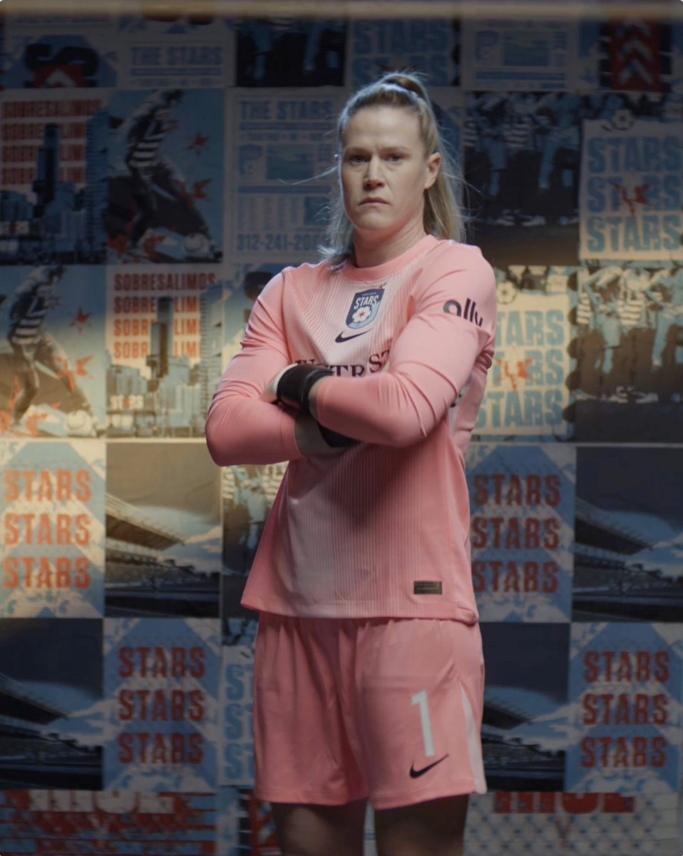
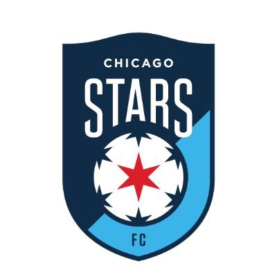
Somos Chicago Stars FC ⭐
170,977 Aufrufe • vor 1 Jahr •via X (Twitter)
10 Kommentare

Ryanvor 1 Jahr
“Unlike anything you’ve ever seen “

JSvor 1 Jahr
What a massive downgrade. Just sad.

-vor 1 Jahr
@itsmeglinehan “Let’s take out the red in red stars but keep the red star on everything”

大哥七叶树人vor 1 Jahr
This is bland, and terrible. In every aspect. Just unnecessary.

Ryan Fordicevor 1 Jahr
Two of these are in Chicagoland.
Ryanvor 1 Jahr
So bad

Benny and the Gesseritsvor 1 Jahr
I hate you

loganelliott.bsky.socialvor 1 Jahr
Whoever saw the former cool logo that uniquely represented Chicago and said let's trade that in for some bland corporate rebrand needs a serious rethink. I suppose the good news is this logo will be gone in 1-2 years

#1 Hugo Cuypers Enjoyervor 1 Jahr
whyyyy

Abby ⚽️🧏🏻♀️🇺🇸🏴vor 1 Jahr
Oh no….. where’s the Time Machine to go back and undo this? Such a big flop after such a great restructuring of the club after the trauma..