Video yükleniyor...
Video Yüklenemedi
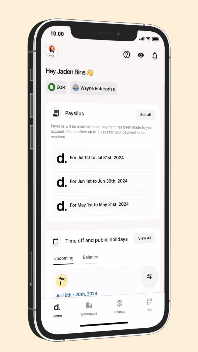
stop duplicating your navigation for mobile 🤙 use the Popover API and some CSS tricks to make it responsive ✅ sidebar on desktop ✅ drawer on mobile ✅ progressively enhance the drag mechanics

256,187 görüntüleme • 1 yıl önce •via X (Twitter)
11 Yorum

here's the @CodePen 🤙 it's a little "rough" around the edges as it was thrown together quick but the concept of reusing the [popover] is sound and works without JavaScript 👀
if you're interested in more of this and want to see me finally make a course, sign up here 👇 it's time we started actually putting in the work

Nice, you could also make the dragging via scroll-snapping! Take a look at
you could, yes I've posted about this before but I'd still opt for JS to do some intended behaviours consistently with better control

How do you do the staggered effect in every word? Css only?

So pro!!! How to make it shareee

Looks great!
a little rough around the edges 🙏 but this is more about the concept of reusing elements instead of doing "duplicates" which I see a lot of 😬

Sheesh

Love the design, but I honestly don’t get a tiny icon at the top right of the screen for a mobile specific design It’s the hardest place to reach Would honestly do it bottom right and the menu items at the bottom, too, easy to access one-handed
it's an example, not a production thing so many apps do it though, jus' make it what you want
![CSS macOS style dock nav with sub-menu 🤙 :has() for magnification ✅ [popover] for the sub-menu ✅ anchor() to tether the menu ✅ offset-path to put items on the curve ✅ linear() for the springy transition ✅ Combining cool APIs to create common UI patterns without JS ⭐️](https://image.24vids.com/tw-1816995007984767342/ext_tw_video_thumb/1816992555239690240/pu/img/6-Kt27OFusB54knj.jpg)