Video yükleniyor...
Video Yüklenemedi
The color that connects us.
728,890 görüntüleme • 1 yıl önce •via X (Twitter)
32 Yorum

IT WAS RIGHT THERE ….. WHY

Is it so difficult to give the people what they want?

Not asking for the moon…

We needed Robo Penguin

wait no I really like it why is everyone sad!!!

Y'know, I don't outwardly hate them

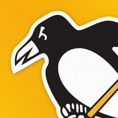
Quit using the floating penguin logo it looks terrible without the triangle

Amazes me that we have countless jerseys that people want to come back and this is the best you guys can come up with.

I know they beat Nashville in 2017 but we didn’t need their jerseys

The snoop dogg still #1

wtf are these

Can’t lie hated when the video started, love them By the end lmao

😕 so much hype for something potentially cool and this is what was delivered. Gotta start taking pointers from mock jerseys the community makes atp.

“Omg these are horrible. I wouldn’t be caught dead wearing this garbage”

Igloo logo goes hard

Put the penguin back in the triangle. The Crest Penguin feels unbalanced without that anchoring it. The 80's Sunday jerseys are still the best primary gold jersey we've ever had.

Kinda lame, but not awful. They’ll grow on me

@DanPotashTV Couple things; yellow is awesome! Matte lids, cool. Number font is hideous! Makes them look like Predators hand-me-downs. Always use the golden triangle! Put aspects of the flag/crest on the actual jersey. These are the worst iteration of the yellow unis you’ve worn. :/

i love yinz 😭❤️ gold jersey ftw

GOD FUCKING DAMNIT THE DAMN FLOATING PENGUIN

Coldplay's Yellow would have gone hard here.

@NHL That's the predator's jersey 🤔

You can tell the people who aren't connected to the 80s.

anyone wanted to buy the new alternate jersey they dropped them online

Thanks they fucking suck

Suprised at the hate. I love these. Then again the gold may mean more to us older PM fans. (Pre Mario)

Uniform connoisseur here: these aren’t great. Should have gone with the gold throwbacks and then add those patches to modernize it. #LetsGoPens

Go Pens!

This is not what we wanted..

Damn these are garbage😔

🤮

I'm dying, why are y'all throwing back to the Philadelphia Quakers with that striping, the one-season wonder Pittsburgh's old NHL team became 😭









![[📺] YVES 2026 AMERICAS TOUR : What Connects Us Watch the full video here! 🔗](https://image.24vids.com/tw-2072657791396032764/amplify_video_thumb/2072652552462794752/img/0JKVzW3FTVuubGAd.jpg)