正在加载视频...
视频加载失败
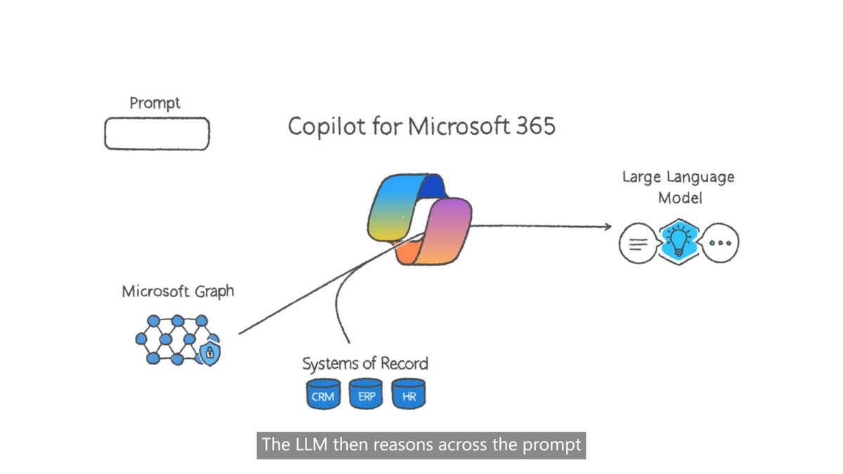
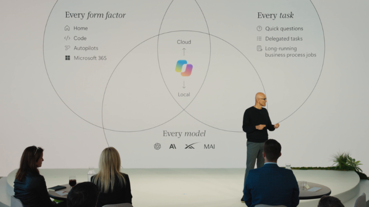
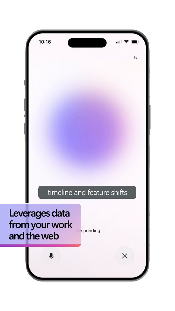
The Microsoft 365 Copilot app just got a redesign. Cleaner. Faster. And designed to move with how you actually work. See what’s new:

19 条评论

Change the M365 App Icon first, and with design make sure app doesn't lag. make the app smooth. i don't know why most of the MS apps feels laggy and buggy. WHY???

Why?!

is it winui? might as well get an iconic name for “the” work app. or just call it “office”, because it does everything

Which copilot product you have around 35 of them called copilot

hopefully this means it can finally find that spreadsheet i lost three months ago

Amazing!

Thank you, Eric!

🔥🔥

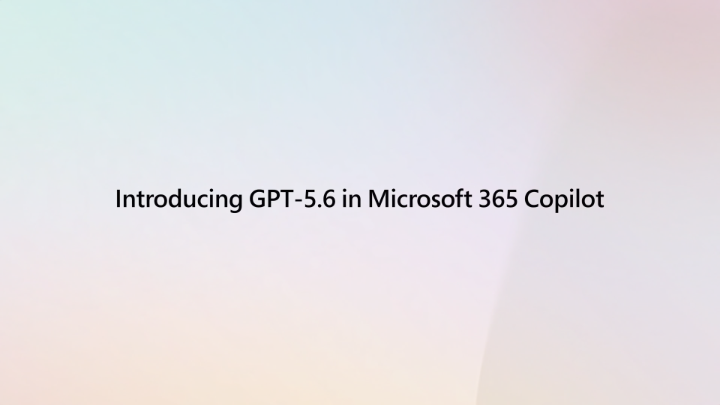
Why doesn’t the Opus option show version code like the GPT?

It does look decent...tbh!!

I received the update over night, I like the look, but the performance today was awful, over 5 mins to do a simple task. I was also delivering a live demo to over 60 colleagues to show off its power! And as an aside why has the create feature been moved???

The real redesign is the prompt box growing up. In a doc, deck, sheet, or inbox, Copilot should bring the relevant action to the edge of the work, then get out of the way once the draft, chart, or reply is better.

Is this rolling out slowly? I don't have it, even though I updated the apps. Or is it only for M365 Premium?

No colour :(

@IgorZaika What happened to the nature-ish design? :)

I can tell y'all spent quite the weekend on this one huh

Elegent~

1111

Way better