Video yükleniyor...
Video Yüklenemedi
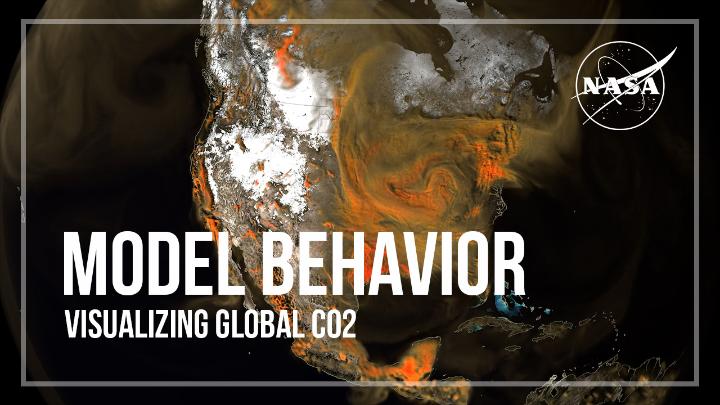
This global map visualization shows concentrations of carbon dioxide (CO2) as it moved through Earth’s atmosphere from January through March of 2020, driven by wind patterns and atmospheric circulation.

510,872 görüntüleme • 2 yıl önce •via X (Twitter)
10 Yorum

Interesting global map, but it raises questions: if CO2 levels were so dynamic, how effective are current climate policies?

Why is it pulsing? And what instrument is used to measure a specific molecule?

The pulsing comes from fires flaring up during the day and dying down at night, as well as the absorption and release of CO2 as trees and plants photosynthesize. The data come from GEOS, a high-resolution weather model that pulls in billions of data points from ground observations and satellite instruments, such as the Terra satellite’s MODIS and the Suomi-NPP satellite’s VIIRS instruments.

Now do one for the temperature effect of that CO2, net of the cooling effects of cloud cover between 11-13 km altitude. That would be really cool, no pun intended.

great. hopefully Co2 levels will grow and plantlife will flourish

Another cgi rendering of a fake problem.

Thank God for CO2 - The Food of Life!

Awesome! Great for Trees n Plants.

The flow of plant food.

This is mind blowing 🤯






!["If we halved the carbon dioxide content [in the atmosphere], we would have no life on Earth." Geologist Prof. Ian Plimer: "For about 80% of time [the atmosphere] was carbon dioxide rich... We had ice ages at the equator, and we had ice at sea level... yet the atmospheric carbon dioxide content was 20%." "And we're told that at 0.04%, if we increase it by a little bit, we're going to have runaway global warming. We didn't have it in the past, so why should we have it in the present?" "So we geologists see that this is a load of nonsense." "When we look over time, we see that carbon dioxide has decreased... We are at a dangerously low level. If we halved the carbon dioxide content, we would have no life on Earth."](https://image.24vids.com/tw-1864626459844706526/ext_tw_video_thumb/1864626332581171200/pu/img/HDdEGlrCPGNRpLH-.jpg)