Загрузка видео...
Не удалось загрузить видео
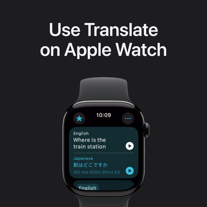
watchOS 10 is the most significant update for Apple Watch since its introduction. In “Meet watchOS 10”, I share an in-depth look at how we designed the new user interface and how you can use the same design principles to make great apps of your own.

526,513 просмотров • 3 лет назад •via X (Twitter)
Комментарии: 10

These videos truly take an army to produce and I am so grateful to everyone at Apple who helped make this shine.
Join @LoriHC, @_mattkoonce, Jennifer Patton, and I for a Q&A about the watchOS 10 redesign at 11 AM PDT

why did you get rid of the dock?! It was one of my most used features, one that would potentially stop me from updating because it's a core feature.
In watchOS 10, you can access recently-used apps by double-clicking the Digital Crown.

What is different? Almost looks identical to previous iterations.

Definitely a star of the show for me! Loving the full color look and new interaction schemes, and can't wait to adopt it for @weathergraph.

I really love how much more colorful and lively it feels! Great job!

I don't know how to access notifications on watchOS 10 ... Also the "red" mode for the watchface is gone on the Ultra😕

So much colour 😍 👏

Nice work! A great update.