Загрузка видео...

Не удалось загрузить видео

На главную

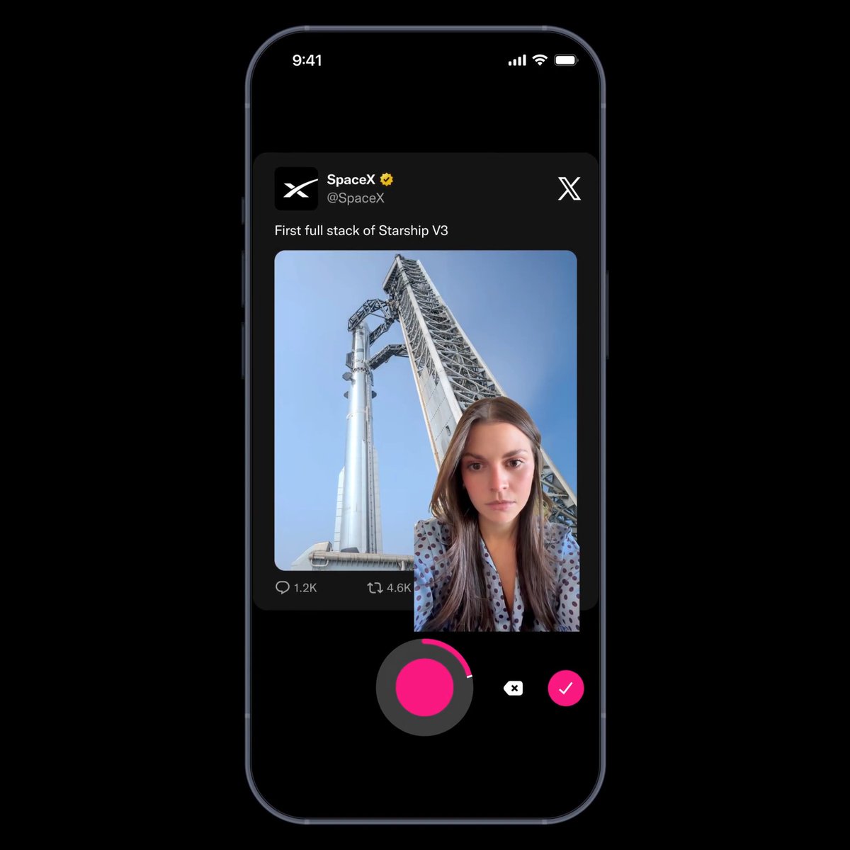
We built this onboarding flow in React Native that feels better than most native apps Here’s how we did it: ① Patched react-native-screens for a custom transition ② Button and stepper are rendered on top of the stack ③ Synced button state across screens via context The button and...

230,817 просмотров • 1 год назад •via X (Twitter)

Комментарии: 35

Фото профиля Marc
Marc1 год назад

why not a single screen, with step body components?

Фото профиля Ludwig Vaan
Ludwig Vaan1 год назад

Did you try to achieve this result using a pager view? Switching screens isn’t mandatory

Фото профиля Gabriele Scotto di Vettimo
Gabriele Scotto di Vettimo1 год назад

Super impressive! Do you mind if I share it with the react native community?

Фото профиля Yehia
Yehia1 год назад

Could do it with a flatlist with pagingEnabled

Фото профиля Ant Setiadi
Ant Setiadi1 год назад

Impressive! It is really smooth. Are you guys using expo-router or react-navigation?

Фото профиля MT⚡️
MT⚡️1 год назад

09:41 🧐

Фото профиля Mick
Mick1 год назад

Beautiful! Is there a chance to open source this?

Фото профиля Conor
Conor1 год назад

Beautiful attention to detail. Worked on an identical flow but couldn't figure out how to keep keyboard open. Thanks for the tip!

Фото профиля Constantin 🔥
Constantin 🔥1 год назад

I've recently tried to build a good onboarding, but this is just next-level.

Фото профиля Ryan O'Hara
Ryan O'Hara1 год назад

Damn that’s smooth! Nice work

Фото профиля Kyle
Kyle1 год назад

Looks great

Фото профиля Billel Boudchicha
Billel Boudchicha1 год назад

Built a similar multi-step wizard but kept everything in one screen. Used Reanimated for smooth left↔️right transitions and XState FSM to drive the whole flow. Header & button are absolutely positioned too. Your keyboard-surfing trick is 🔥 — super fluid work 👏

Фото профиля Ivan Ry
Ivan Ry1 год назад

That's my exact problem with React Native after trying it for one month. Brother could write this flow in 2 hours in native code instead of spending time on all this React Native dancing...

Фото профиля pedro
pedro1 год назад

code plzzz ?

Фото профиля Shreya Mishra
Shreya Mishra1 год назад

How exactly did you patch react-native-screens to implement the custom transition? Can you share key code snippets or explain the approach?

Фото профиля JGF
JGF1 год назад

clean

Фото профиля Abhijeet Sharan
Abhijeet Sharan1 год назад

Looks smooth

Фото профиля Mayor
Mayor1 год назад

Love it

Фото профиля ª
ª1 год назад

@datboychapo

Фото профиля Davide Espertini
Davide Espertini1 год назад

wow! really impressive work!

Фото профиля Max Hoffmann
Max Hoffmann1 год назад

Damn this looks clean, I love it. Is there any chance you will open-source this?

Фото профиля Melvyn
Melvyn1 год назад

Keeping the keyboard open is really cool, love it !

Фото профиля Ice Bridge
Ice Bridge1 год назад

Looks clean! Love it!

Фото профиля Tyler Coffman
Tyler Coffman1 год назад

Just use a horizontal flat list with paging

Фото профиля dany
dany1 год назад

smooth

Фото профиля EJ Campbell
EJ Campbell1 год назад

Does it interact properly with auto-fill passwords?

Фото профиля Marlon Johnson
Marlon Johnson1 год назад

Im trying to achieve something similar

Фото профиля voj
voj1 год назад

this goes hard

Фото профиля julian
julian1 год назад

Very cool approach

Фото профиля Youss
Youss1 год назад

Nice work 👌🏽Seems a little bit over engineered though

Фото профиля Smoking Chimp
Smoking Chimp1 год назад

Sooo buttery. Great work on this.

Фото профиля 0xRay
0xRay1 год назад

@StreamviDL

Фото профиля Emmanuel Andy Eze 🇳🇬
Emmanuel Andy Eze 🇳🇬1 год назад

Amazing 🤩

Фото профиля Taylor Symonds
Taylor Symonds1 год назад

Ayo, very few will actually appreciate this. Looks sick g, well done

Фото профиля Ale
Ale1 год назад

Each step is a different screen??. It looks great.

Похожие видео

Build uncompromising high-performance, high-fidelity apps with React. What you see is not the Apple Messages app, nor is it meant to be 1:1. Rather it serves as an aspirational and real example of UI/UX that is possible. Every detail from the bubble animations to keyboard gestures to scroll view insets and safe areas to parallax timestamps required care and attention. Quality UIs come from caring hard. The little chat bubble tails that morph away when the next message animates in. Timestamps that scroll at a different rate than the bubbles. Peek gestures powered by UIKit that lift a chat bubble, tail and all, with a gentle haptic pulse. The subtle shadow of the text composer and responsively sliding down the keyboard in pixel-perfect concert. The composer shrinking its width to fit iPhone’s rounded bezel. The beautiful Liquid Glass refractions have the level of glassiness chosen by the user (new in iOS 27). Scroll view insets that adjust to fit the home bar and keyboard dynamically, creating a sense of depth as the chat bubbles are slightly visible as they scroll under the keyboard. Keeping the keyboard on screen if the prior screen already presented it. Sliding the keyboard and composer with the screen when the user drags to navigate back. I am excited to explore using the new iPhone Duo view controllers natively with React when the time comes. There is always room for innovation and improvement. This chat demo runs at 120 FPS on iOS 27 even on my phone that’s four versions old now. There are several approaches to high-performance lists. I explored a new Expo scroll view that uses the native gesture systems along with react-native’s VirtualView (codenamed “Fling” to reflect the speed of flinging a scroll view), which Meta’s React team designed to prioritize scroll momentum with React’s scheduler. There are tradeoffs with other scroll strategies for how the scroll views gracefully degrade, and they can be swapped out based on what’s best for your app’s use case. And, by virtue of using modern React, high-priority events like user gestures can preempt lower-priority ones like a network response. Let us dispel any myth that using React requires compromising on beautiful, smooth, user-friendly UI/UX that Uses the Platform. Let us dispel any myth frame-perfect UI coordination is not achievable. The Hermes thread and the UI thread can coordinate when needed, like for controlled text inputs. Let us dispel any myth that React Native’s performance is impacted by a bridge, let alone has a bridge. Bridgeless JSI and the Fabric renderer are here for apps that use the New Architecture. What about Android? The app runs and I’ll share a screenshot from my cloud agent’s emulator. With some attention to detail dedicated to Android I’m confident crafted UX is attainable. I’ve spent my tokens once and have a structural head start everywhere. One more thing! Most of this chat’s application code is written with , , , and other familiar elements. The styling is mostly CSS, including linear-gradient(), background-attachment: fixed, and semantic platform colors that adapt to dark mode. Not just appearance - CSS Animations and CSS Transitions run entirely natively. There are a handful of custom native components written in Swift and Kotlin, like the chat bubbles and a custom CAShapeLayer and UIBezierPath for the tails. Native coding is a first-class feature. The way to think about building beautiful apps this way is React and Native, not React vs. Native. Aspire high and raise your ambitions for what is possible!

James Ide

142,196 просмотров • 2 месяцев назад