Video wird geladen...
Video konnte nicht geladen werden
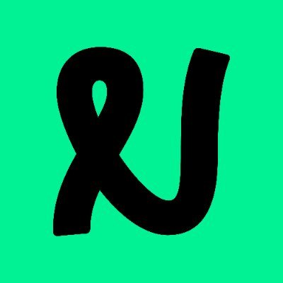
We’re excited to introduce our new brand look, reflecting our commitment to inclusivity, progress and community. For 175+ years, we’ve supported unique financial journeys and now we’re evolving to better meet your needs. Welcome to a different kind of society! #FinancialDiversity
11,286 Aufrufe • vor 1 Jahr •via X (Twitter)
10 Kommentare

I should change your name as well as you have nothing in common with the good folk of Nottingham and Nottinghamshire.

It looks like a U. It’s the Uottingham. This is one of the worst brand changes I have ever seen. It’s gone from looking like a firm with a strong local connection to something that looks like a cheap charity logo.

This logo is ridiculous. Means nothing about Nottingham or the building society. It doesnt stand out, doesn’t mean anything… waste of money in my eyes! Ruined a well known brand and what is wrong with celebrating/using a well known English legend!

Who persuaded you that the new logo was a great idea. It’s abstract nonsense for which you were no doubt charged a huge sum.

What's wrong with you? What's wrong with #RobinHood, fighting oppression and taking from the rich to give to the poor? As a Nottinghamian, I can say your totally idiotic and unnecessary rebranding has been carried out by morons. Robin Hood is a global icon, linked to Nottingham!

Robin Hood’s been cancelled then in the name of diversity. I note the Nottingham Guy Fawkes night bonfire has also been cancelled.

Did you pay a 3yr old to produce it with crayons for you! What was wrong with #RobinHood?

Stop pandering to minorities and just do money and mortgages. 🙄

Huge own goal, looks like the ‘vine’ logo! Baffling decision to get rid of such a strong and identifiable badge.

Shocking rebrand, absolutely awful. Completely lacks any culture or identity