Загрузка видео...
Не удалось загрузить видео
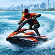
Which lighting do you prefer - A, B, or C? #indiedev #gamedev #racinggames
68,046 просмотров • 25 дней назад •via X (Twitter)
Комментарии: 35

Not B Cant decide between A or C

C is so vibrant and beautiful, but it needs more yellow and green tones I feel

C is good, I just think you need some stylized clouds to go with it

A is best by far. B is terrible and hurts my eyes. C is ok, might work for a course with cold water, like a mountain lake or the arctic.

C. A is also good, but it’s a bit dark. B seems washed out.

A for places like fortresses and surveillance outposts—areas with a lot of concrete or metal. B for clean environments like islands or tourist areas. C for mountainous areas with lakes

C, with the colours and saturation bumped up! 😁

A - by far best colours and contrast. Looks most pleasant altogether.

A has a darker more grounded realistic tone, B feels too light and saturated, C has a more natural light tone and colour. I would say if you want realism A, if you want a more natural feel C, B just doesn't quite fit the vibe that it looks like your going for.

C

A or C, but increase visibility/color on player character

It's hard to see due to X crushing the bitrate, but I like A the best, followed very closely by C. In A, the skybox has a nice range of colours, the lighting looks good and the scenery pops more. C's water probably looks the best, but the lighting and scenery looks a bit off.

I think C is best, but I hoped to see race courses with differnt times of day

A>C>B You should add some delay to the camera when it follows the player's movements

A 100%

A definitely

I'd say A for the current character and jet ski color palette, and a more realistic vibe, C looks more 'fun' but would prob require a recolor of the character and jetski to match it

A… seems to me perhaps the most realistic but perhaps too overcast. B… is too bright & washed out. C… is Waverace 64. Less realistic but nice to look at.

C seems the most fun

A
I love the music you use, btw.🎵

A

Probably C, although could use a bit more saturation, color and lighting effects (glints, flares, rainbow-effect, whatever it all is called. Just throw it in there like it's a party) A & B seem a bit too muted, muddy, sandy.

C if it had the cloud definition from A

@ArcadeRacing_0 C plus agréable à l’œil

C all the way babyyyyyyyyyyyyyy

Depends what you're going for, and I'd have to see more variations for all 3 settings but I'd say something like this you want the colours to pop, and have the water look as realistic. Based on that criteria: C, *but* I'd go with A... with a few more tweaks.

C, definitely

A and C Either way this look pretty damn AWESOME

With current color scheme and environmentsoptin A is the best choice

C is by far the best. Natural colours I see at beaches in real life and not having clouds means I don't get motion sickness, unlike A and B. B looks the worst because the colours look like just before a storm, but the clouds are not the correct type for storms.

B

I like C the most A is too muted, B is too bright. C has the kind of water colour i love the most, reminds me of games in my childhood

Def C

C
Похожие видео


Sensitive content
It's the throat Goats, Which you prefer? A B C D
FreaksComeOutAtMidnight
144,080 просмотров • 2 лет назад


Sensitive content
Which outfit do you prefer? Green or blue?
kindly myers
74,634 просмотров • 1 год назад


