Загрузка видео...

Не удалось загрузить видео

На главную

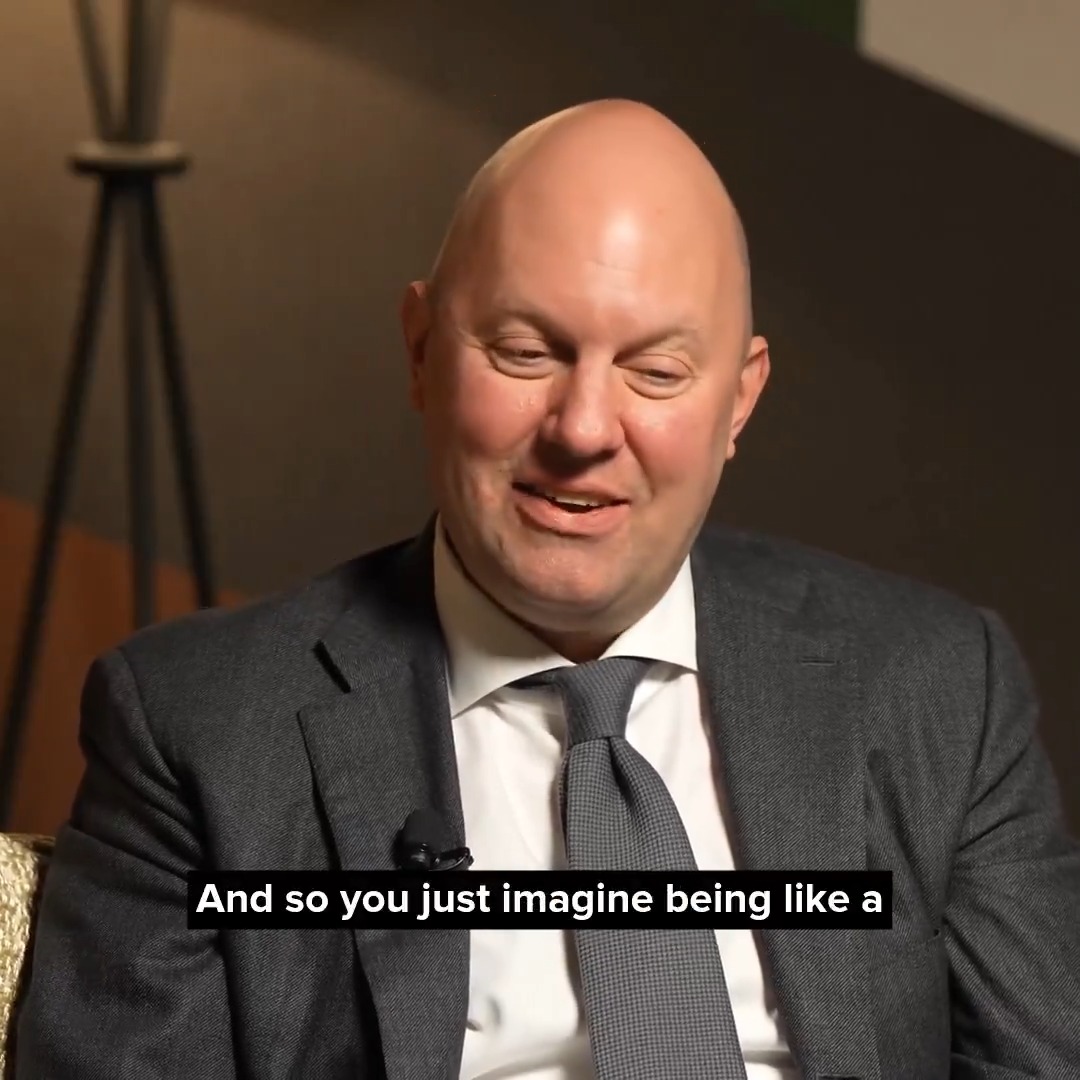
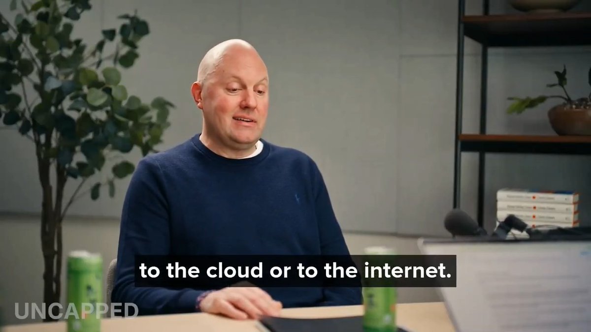
Why are hyperlinks blue?

7,624,878 просмотров • 1 год назад •via X (Twitter)

Комментарии: 39

Фото профиля Brent Liang
Brent Liang1 год назад

>"why are hyperlinks blue" >"because i like blue"

Фото профиля a16z
a16z1 год назад

👑

Фото профиля Tony Aubé
Tony Aubé1 год назад

IMO he picked the best option out of the 256 available

Фото профиля a16z
a16z1 год назад

💯

Фото профиля Daniel
Daniel1 год назад

i mean, they have to be blue, is there any other option?

Фото профиля a16z
a16z1 год назад

It's hard to imagine

Фото профиля Daniel
Daniel1 год назад

If I imagine a different color, do I get a job?

Фото профиля Acetic Acid #StopMBG
Acetic Acid #StopMBG1 год назад

But I know a nice theory. Why after clicking a link, the color changes from blue to purple? Because you "red" it.

Фото профиля Matt Jensen
Matt Jensen1 год назад

On behalf of all colorblind people everywhere, thanks for not choosing red or green. I was able to tell the difference between visited and unvisited links because he made this choice.

Фото профиля Alex Greenland
Alex Greenland1 год назад

brutalist blue

Фото профиля a16z
a16z1 год назад

Art Deco.

Фото профиля Aman
Aman1 год назад

That's actually a wonderful UX decision from his side too, blue is the most visible color for color blind people making early web days accessible. What a man😅!

Фото профиля Mel Rivera Mills
Mel Rivera Mills1 год назад

Bro really said

Фото профиля Tina LaPorta
Tina LaPorta1 год назад

Next question: why are visited links purple?

Фото профиля Josiah
Josiah1 год назад

so wild when I heard this! haha love it

Фото профиля a16z
a16z1 год назад

Glad you enjoyed it! More shorts coming

Фото профиля EOIN 🏴
EOIN 🏴1 год назад

"Everything around you was created by people no smarter than you" - Steve Jobs

Фото профиля Alex Greenland
Alex Greenland1 год назад

and why purple for visited links?

Фото профиля Walter
Walter1 год назад

It’s pmarca’s world, we’re all just living in it

Фото профиля Rakin
Rakin1 год назад

Because blue was one of the few colors clearly distinguishable on early low-resolution monitors, and underlined blue text had never been widely used in print, making links obvious to users.

Фото профиля Laissez-Faire Group
Laissez-Faire Group1 год назад

So basically… the internet is blue because 90s monitors sucked 🤣

Фото профиля Deej
Deej1 год назад

Wait 50 years for some teacher saying some bs that hyperlinks are blue because "something something symbolism blah blah blah".

Фото профиля Saша Stark 🔳 Zero to Null MRR 🔳 swe/av/acc
Saша Stark 🔳 Zero to Null MRR 🔳 swe/av/acc1 год назад

TL;TW: Make decisions on personal likes could be the best decision.

Фото профиля Henry Schlesinger
Henry Schlesinger1 год назад

@grok how did Marc Andreeson get to make the decision relating to the color of hyperlinks?

Фото профиля John Wang
John Wang1 год назад

chad

Фото профиля Stephen McLoughney
Stephen McLoughney1 год назад

Sounds like a pretty good reason to me!

Фото профиля Berry
Berry1 год назад

It’s crazy how many things are like this, Numpad for calling, keyboard layouts etc. the designer is in the designs

Фото профиля Aura Launch
Aura Launch1 год назад

Pretty based tbh 🟦🫡

Фото профиля jac3k
jac3k1 год назад

>Product Manager: We need to user-test 41 colors. >Boss: I like this one 🔹

Фото профиля paulmaah.
paulmaah.1 год назад

someone made everything means i must make something

Фото профиля The Short Straw
The Short Straw1 год назад

Changing all my hyperlinks across my system to RED.

Фото профиля frye
frye1 год назад

that’s my moot 🥹

Фото профиля Uninvited
Uninvited1 год назад

Fun to think that everything we've gotten used to started off as simple as "yea that looks nice"

Фото профиля caominhweb3
caominhweb31 год назад

becos red means danger

Фото профиля Kayloni 🫧
Kayloni 🫧1 год назад

It's a good question

Фото профиля Data™
Data™1 год назад

that’s crazy

Фото профиля 🕊️
🕊️1 год назад

Blue is the best colour honestly

Фото профиля Powderkeg Kitten ❤️🐈‍⬛
Powderkeg Kitten ❤️🐈‍⬛1 год назад

Woahhh that’s so cool :0

Фото профиля Rahul Chakraborty
Rahul Chakraborty1 год назад

fair enough!

Похожие видео

Today, a16z is announcing the Machine Age Fund, a new $1.1 billion fund for founders rebuilding what intelligence runs on: chips, memory, networking, systems software, power, and the machines that bring AI into the physical world. Ben Horowitz, Martin Casado, and Raghu Raghuram see a new economic law. A thousand engineers cannot erase a two-year software lead, but a massive GPU cluster can turn capital directly into capability. Models are improving faster than the memory, interconnect, power, and cooling beneath them. The founder map is changing with it. Some of the strongest teams are moving from pure software into complex hardware because every constraint in the stack is now a company-building opportunity. In this conversation with Erik Torenberg, they explain what founders can build, why the opportunity reaches all the way down to the physical stack, and why a16z created a fund for it. 00:00 Intro 01:08 Why AI needs an entirely new infrastructure 02:02 The bottleneck is no longer the model 02:40 Founders saw it before investors did 06:07 Sold out through 2028 07:14 Why this time is different from 1999 08:57 The company whose idle hardware gained value 10:51 "Why didn't this fund exist five years ago?" 13:51 "Nobody likes to use AI more than AI" 17:06 The startup law that capital just broke 21:05 What Grok Bot got right 26:43 The case for a custom chip per model 28:23 Why AC power isn't good enough 32:07 Lots of new electricians 34:14 What one gigawatt can power 35:03 Why utilities can't just build faster 37:22 The data centers that give power back 38:01 Why we should never have called it AI 39:43 Why Nvidia will willingly leave money on the table 48:08 Hardware founders are older 52:36 Why America has to lead YouTube: benahorowitz.eth Raghu Raghuram martin_casado Erik Torenberg

a16z

643,118 просмотров • 1 месяц назад