Video wird geladen...
Video konnte nicht geladen werden
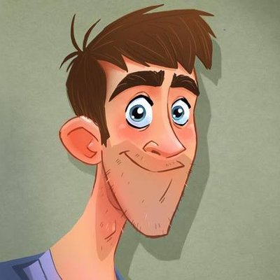
Why your drawings look flat
1,292,841 Aufrufe • vor 8 Monaten •via X (Twitter)
38 Kommentare

when bro possibly has beef w alex hirsch but you cannot prove it

This kind of just looks like a difference in style all together neither look bad or wrong

This type of "tip" only leads to the belief that there is one drawing style that is more complex and technically correct than another. Which, despite good intentions, is quite dishonest and discouraging

The left looks like a character in an animated show, where simplification is necessary for speed of production, the right looks like the children's book the show is based on. Both have their place, and neither is bad.

I've seen this image before. Did you make it? Or are you just tracing over some image you found on google? Because the lesson the image teaches is useful and insightful, but the one you're giving with your voice is kinda shitty and oversimplifying.

Haha yeah I made it. Google mitchleeuwe :)
Oh. Then why are you suddenly using it for such one-sided advice, man? You were doing so great, now it looks like you're throwing shade at Gravity Falls 🫠
...now I see that this is engagement bait so people pay for your Ebook and Video Tutorials. That's kinda lame, man.

what if its just their style?

It's funny that the Gravity Fall style one (that you crossed out as "bad") actually looks better here, your Disney style one is kinda... weak.

i've followed you for a while now and i think your tutorials are great, but this one i don't understand. i feel like there were other ways you could've shown how to avoid unintentional flatness but you're framing a purposely stylized look that has nothing wrong with it as "bad"

You didn't correct anything, you just applied a different style. I would classify this content as indoctrinating, but it's just misinformation.

Different styles, none better than the other.

People discovering that there are other art styles besides their own.

One is simplified and shorthanded for the use of animation where you need to clutch thousands of drawings within a handful of days if not on the same day deadline. The other is closer to illustration purposes or a 2D puppet rig. Drawings can vary greatly depending on the goal

Bro is ragebaiting

I hate people "fixing" drawings.

No way...

a lot of ppl are misinterpreting this as "don't draw like the left example" when the point is to teach people who want to draw more organically how to achieve the look they want.

Mitch, you can't tell me what to do! I can draw in whatever style I want!

Bro's beefin @_AlexHirsch

wanting to ape a specific style is fine, but is presenting another established style as objectively "wrong"(?) a productive impression? both of these characters are drawn with respectable stylistic principles. the comparison is funny though, knowing both are technically "disney".

no hate to you but that's just tl;dr calart style bad

I prefer the flat example.

The first image is also an example of straight vs curved lol. These kinds of binary examples do a terrible job of explaining how these "rules" are merely guidelines and should not be treated as the norm in art. It's exactly why I never liked the adherence to shape language either

Ughhh people just because the first doesn't look bad, the advice is still correct. This is just good design theory that will usually result in better chracter illustration.

It's all about shaping

Is this guy iconic enough for ya

that's literally a gravity falls character vs the guy from the lorax

True, but one of these styles is way easier to animate than the other lol

It looks flat because you didn’t shade it😐

Bro did not like Gravity Falls

So basically wrong art style VS right art style?

I really do hate this artstyle. Only Gumball knew how to take advantage

I prefer the flat one. Not because I believe it is the only right art style. But because, I personally like it more.

I don’t see anything wrong with the first style. In fact he looks like he came straight from Gravity Falls. You lost your audience & teaching lesson the moment you ❌ it. Now if it was a “let’s draw this character in a different style”, than your lesson would have been stronger.

Dude, the first option is literally the Gravity Falls style. These are two completely different drawing styles. That's why the concepts of 2D and 3D exist.

Imo the flat one looks better!
Ähnliche Videos




Sensitive content
You look less flat 😂
Ifeoluwa🦋
149,138 Aufrufe • vor 8 Monaten