Video wird geladen...
Video konnte nicht geladen werden
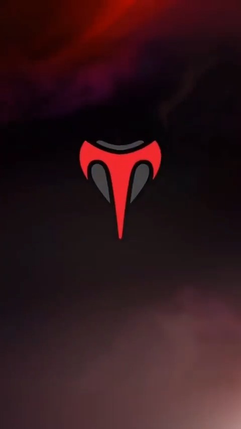
Yo overwatch we gotta discuss these talon logos

620,087 Aufrufe • vor 7 Monaten •via X (Twitter)
31 Kommentare

I really wish they would stop doing these weapon variants so extra. People have been asking for Diamond, Ruby, Silver, Platinum, and all these other more basic materials forever. I wish they'd add two each year, one based on the story theme (like this) and a standard one.

why make the coolest color a greenscreen dude @aaronkellerOW Why

shit makes me uncomfortable

Wait they dont move with the hammar, its like they stuck a gif inside it😭

Remove the Talon logo’s and the skin becomes 1000x nicer, I will simply never buy this skin or anybody who’s weapons are bigger than a couple inches, im sure on Kiri & Moira these go hard as fuck,

I like them, they feel like a chowder episode lol

No, like actually, those ugly talon logos ruin that weapon skin

Green screen skins are so dogshit

this green screen bullshit

dear god this sucks

I didn’t see them for a moment cuz I’m on my phone and I thought the stationary logos were just fucking glare

WW png grid

If you think about it, for their timeline is like if they used nazi symbols pretty much

it’s sooo ugly

I hope they get rid of them after this talon themed season ends

I think it looks nice 😂

If this didnt have the talon symbols itd be the best comp reward tied with galactic With these talon symbols its lowk worse than jade

durpee makes a skintwt post and immediately gets almost 7.5k likes LOL

Logos overwhelm the vibe. Clean it up for real edge.

Chowder ahh comp overlay. It's funny because Galactic is in the same boat, but at the same time it's not nearly as distracting.

remove the talon logos and it’s peak blizzard 😭

Honestly it would look way better without the logo anyways

what am i looking at here

I think it looks fine but I do think it might look a tad better without them

for real can we make it louder cause red weapons would go so hard but I despise the logo

Looks like an water mark

what would you like to talk about?

What am I not seeing here?

They should let you toggle it off if you'd like

lol they look like little talon watermarks

Should have just made it red they doing too much