
virgil pana
@virgil_pana • 2,711 subscribers
Product Designer interested in Web Apps and Agentic Design
Shorts


Videos

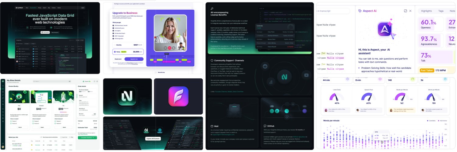
As part of my assignment, I was tasked with designing a high-density data grid for an SEO platform. During development, our analysis of Google Analytics data revealed that the majority of our users access the platform on 13-inch display laptops. This insight necessitated optimizing the data grid for this screen size. A key challenge we encountered was the sidebar housing keyword filters, which occupied a significant portion of the available space. Since this feature was integral to the page, removing it was not an option. Even making it collapsible would have had minimal impact on the overall layout. Our initial approach involved implementing an inner horizontal scroll to accommodate additional columns. However, this solution introduced technical limitations due to the grid’s accordion UI pattern, which enables users to expand rows for detailed views. This functionality effectively split the table in half, making it difficult to synchronize scrolling across two separate grid sections within modern browsers. To address these constraints, I devised an alternative solution: implementing auto-expandable and collapsible columns based on content visibility. For instance, the "Flag" and "Performance" columns dynamically collapse by default and expand when hovered over, allowing users to access the necessary details when needed. This approach enabled us to fit all columns within a 13-inch display without relying on horizontal scrolling, ensuring a more efficient and user-friendly experience.
virgil pana44,560 просмотров • 1 год назад
This is what 4 months of studying Rive can get you, I started to learn Rive in January and made most of these in May-June.
virgil pana22,323 просмотров • 11 месяцев назад

Больше нет контента для загрузки