Just dropped a full character selection UI/UX sequence for... NEXUS/7 🎮 From roster → loadout → weapon inspection → phase modules → ready to deploy. Clean Swiss-editorial design, acid-lime accents, and a sharp focus on Operator Lira Kade. Made with MiniMax Design (H3) #MiniMaxH3show more
Arcane | Artificial Intelligence
48,836 просмотров • 1 месяц назад
MiniMax H3 is a serious upgrade for AI video... creation. Instead of relying on just text prompts, you can combine images, videos, and audio references to control the character, motion, camera, and sound. What stands out: → Up to 9 image + 3 video + 3 audio references → Native synced voice, music & sound effects → 2K video generation up to 15 seconds → Instruction-based video editing → Motion transfer → Better character, camera & voice control The interesting part is that you can build a full scene from references instead of endlessly regenerating until the result feels right. 🔗 Now is a great time to try MiniMax H3 on Magnific, especially with the current 2K offer.show more

Tanvir Anjum
32,271 просмотров • 1 месяц назад
Claude Fable 5 + Claude Design is f*cking insane... 🤯 Anthropic just dropped its most intelligent model ever, and the first thing I pointed it at was email design. I built a complete email campaign design in Claude Design, and the difference is night and day: tighter layouts, cleaner hierarchy, on-brand from the first generation. All inside Claude Design with Fable 5. Perfect for DTC brands and agencies who are still paying email agencies $3-5K/month for campaign designs that take 2 weeks to ship. If your campaign calendar is packed but every new email means briefing a designer, waiting on mockups, sending notes, and waiting again... This workflow eliminates the entire bottleneck: → Load your brand design system into Claude Design once (colors, fonts, logo, button styling) → Switch the model to Claude Fable 5 — Anthropic's new state-of-the-art model with the best vision of any AI → Prompt the campaign email section by section: header, hero, headline, offer block, CTA → Fable 5 nails layout and brand details that older models fumbled → Iterate inline — swap images, adjust styling, color-pick directly in the canvas → Export the finished email and hand off to your ESP No briefing a designer. No 2-week turnaround on a single campaign. No paying an agency $4K/month for 4 emails. What you get: → Campaign emails designed in minutes, not weeks → A reusable design system every new email pulls from automatically → Noticeably smarter design decisions from Fable 5's upgraded vision → Full inline editing before anything touches your ESP Built 100% with Claude Design + Claude Fable 5. I recorded a full walkthrough showing exactly how this works. Want it for free? > Like this post > Comment "FABLE" And I'll send it over (must be following so I can DM)show more

Mike Futia
43,283 просмотров • 3 месяцев назад
Started as a rough sketch, turned it into a... full freestyle. 16 counts, clean flow, just feeling the rhythm. Made with Seedance 2.0 on Yapper Image Prompt: A colored pencil sketch style choreography sheet infographic for an urban street dance solo performance. Layout: 16 steps arranged in a clean 4x4 grid, each panel showing a different breakdance-inspired move. Subject: a teenage Asian girl with long wavy hair, wearing effortless urban streetwear with stylish layered details (oversized washed black hoodie, loose cargo jogger pants, fitted inner top, chunky sneakers with muted grey, soft lavender, and faded blue accents, silver chain accessories, fingerless gloves). Style: hand-drawn colored pencil illustration, soft shading, visible pencil texture, slightly sketchy but clean lines, muted urban tones blended with subtle pastel accents and dark outfit contrast. Movement: each frame shows dynamic breakdance motions and freestyle street dance energy (toprock, footwork, spins, freezes, slides, shoulder drops, groove transitions, power poses), with small arrows indicating movement direction, momentum, and flow. Design: modern urban dance aesthetic, minimal and stylish infographic layout, subtle graffiti-inspired visual accents, step numbers (1–16), short captions under each frame. Text: Title at the top — “URBAN STREET BREAKDANCE – 16 COUNTS – 10 SECONDS – FREESTYLE FLOW”. Environment: simple industrial dance studio background with concrete textures, soft cinematic lighting, minimal shadows. Quality: high detail, sharp composition, balanced layout, editorial dance tutorial poster, stylish choreography reference sheet. Negative prompt: blurry, low quality, extra limbs, distorted anatomy, bad proportions, messy layout, overcrowded design, text errors, watermark.show more

Harboris
19,417 просмотров • 4 месяцев назад
GPT-5.6 Sol is unbelievably good at creating and editing... videos. It can do motion design, product demos, and animations like this one I made by simply giving it a screen recording. GPT 5.6 has the best design taste and significantly outperforms Fable, which relies heavily on repetitive design patterns. To help you experiment with video editing on it, we just launched a collection of 100 ready-to-use skills that show what’s possible and help you get started with video editing using GPT-5.6. These skills can create anything from motion graphics launch videos for your product to a 3B1B-style science explainer video. You can also use them to edit existing videos: add captions, generate motion graphics, create voiceovers, redesign visual styles, translate into new languages, and much more. If you want access to the full library, comment “VIDEO SKILLS” and I’ll share it with you. (You'll have to follow me so I can DM you.)show more

Akash Anand
517,735 просмотров • 2 месяцев назад
When strangers become big sisters in seconds. GPT Image... 2 + Seedance 2.0 on Renoise prompt Create a clean, professional Pixar-style 3D character sheet of a 6-year-old girl, highly detailed, vibrant colors, polished family-friendly animation style. Character Description: Adorable 6-year-old girl with soft dark wavy hair tied in a cute high ponytail with a small pink bow. Big sparkling brown eyes, round expressive face, rosy cheeks, small button nose, and a warm friendly smile. She has a healthy, energetic child body type suitable for a 6-year-old. Outfit: Bright yellow t-shirt, light pink shorts, white ankle socks, and colorful small sneakers (blue and pink accents). Character Sheet Layout: A single clean vertical character sheet with multiple views of the same girl arranged neatly: Top Left: Full-body front view, standing naturally with hands on hips, smiling confidently. Top Right: Full-body 3/4 angle view, showing depth and personality. Middle Left: Full-body side profile view (facing right). Middle Right: Full-body back view. Bottom Center: Large close-up of her face showing 4 different expressions in small circles — Happy smile, Surprised, Shy/embarrassed, and Excited/grinning. Bottom Right: Small extra details — close-up of her ponytail with bow, shoe details, and hand poses. Style & Quality: Beautiful 3D Pixar animation style, smooth rounded shapes, expressive eyes, soft realistic textures, vibrant yet soft lighting, clean white background with subtle light shadows, highly polished, professional character design sheet, perfect proportions, studio quality, sharp details, warm and wholesome feel. 16:9 aspect ratio, ultra-detailed, cinematic lighting. #RenoiseCanvasshow more

Sharon Riley
157,561 просмотров • 3 месяцев назад
Impeccable 3.7 brings linting to design. Until now it... was a skill you asked for help. Now it's a design-system-aware feedback loop that runs while your agent builds, catching slop and design drift before they land. 🪝 Design hooks for Claude, Codex, and Cursor They run after every UI edit and quietly nudge your agent to fix slop and drift. The output isn't another wall of lint: it separates new findings from already-seen ones, flags clean scans, and asks the agent to use judgment. Fix real issues, leave intentional demos alone, save exceptions to config instead of littering your source. 🎨 Slop detection is now project-aware Reads your actual design system from DESIGN.md, your typography, palette, radius scale, and tokens, and flags drift from your system, not just generic AI slop: • this font isn't in your design system • this color is outside your documented palette • this radius doesn't match your rounded scale The same engine powers both the hooks and the CLI, and it's where we're investing next. 🖥️ Live Mode, ready for real projects Svelte/SvelteKit now preview variants as temporary framework components with live params, then accept cleanly back into your source component. Manual text edits got evidence / apply / discard routes, insertions preserve their anchors, and mapped lists and JSX slots clean up far more reliably. ⚡ Leaner core, sharper detector Rule-level evals across 3 providers and 4 niches cut guidance with no measurable lift and dropped examples that taught models bad patterns. The detector now skips hidden and screen-reader-only elements, understands OKLCH alpha and Sass-like inputs, and tightened checks for repeated kickers, oversized H1s, clipped overflow, and cramped padding. 🛠️ CLI caught up impeccable detect loads DESIGN.md by default, motion findings name the exact token or cubic-bezier instead of just "bounce," and impeccable ignores gives real CRUD for exceptions. Hooks and CLI share the same ignores. No split-brain config. Plus a much-improved interactive installer with hooks setup built in. Upgrade: npx impeccable install npm i -g impeccableshow more

Impeccable
233,051 просмотров • 3 месяцев назад
Claude Code + Google Stitch 2.0 is f*cking cracked... 🤯 Google just dropped a free AI design agent that solves Claude Code's biggest weakness: frontend design. One screenshot of a high-converting landing page → a production-ready site for your brand in minutes. All inside Google Stitch + Claude Code. Perfect for DTC brands and agencies who are building advertorial pages and product launch pages for Meta but burning days on designer back-and-forth. If you're running Meta ads and need 5-10 different landing pages testing different hooks, angles, and offers — each one targeting a different audience and pain point — you know the bottleneck isn't the ads. It's the pages. Briefing designers, waiting for revisions, paying $2-5K per page. Stitch eliminates the design bottleneck: → Find a high-converting advertorial that's scaling on Meta → Screenshot it and drop it into Stitch (powered by Gemini 3.1) → Stitch redesigns it with your brand's colors, fonts, and imagery using Nano Banana 2 → Edit sections visually — headlines, CTAs, layouts — without touching code → Export the code and paste it into Claude Code → Claude builds the full production site and deploys to Vercel or Netlify in 60 seconds No designer. No $3K per landing page. No Claude Code frontend that looks like a template from 2019. What you get: → Designer-quality landing pages and advertorials built in minutes, not weeks → Visual editing so you actually see the design before you code it → Nano Banana 2 generating on-brand product imagery and hero shots → A repeatable system — new angle, new page, same pipeline Built 100% with Google Stitch 2.0 + Claude Code. I put together a full playbook showing the exact workflow: how to find winning pages, redesign them in Stitch, and deploy with Claude Code. Want it for free? > Like this post > Comment "STITCH" And I'll send it over (must be following so I can DM)show more
Mike Futia
126,527 просмотров • 6 месяцев назад
I tried MiniMax Design (H3) to see how it... handles real content creation. The workflow is simple. You just write a prompt or drop in an image, and it turns that into a dynamic video with motion, framing, and scene depth. No timeline to manage. No editing setup. No back and forth. What stood out to me: • Text to video and image to video both feel smooth. • It handles motion, camera angles, and flow on its own. • Output is fast, usually within seconds. • Works well for reels, quick ads, storytelling, and idea testing. It removes the hardest part: starting from scratch and turns your ideas into content in minutes. Instead of thinking, “How do I make this video?” You start with, “What do I want to create?” That shift alone makes it worth exploring. Try it here: #Hailuoshow more

Manish Kumar Shah
27,680 просмотров • 5 месяцев назад
Fable 5 just dropped and someone already built a... $10k-looking website with it. Here's the full workflow The smooth scrolling, the animations, the transitions, all built with Fable 5. Here's how to get the same result instead of a generic template. 1. Steal a direction first. Go to Mobbin or Godly and find a site whose feel you love. Screenshot it. Fable copies a vibe far better than it invents one. 2. Grab real components. Pull animation-ready blocks from Aceternity UI or Magic UI. These are built for exactly this look (scroll reveals, parallax, gradients). 3. Prompt Fable with all of it. Switch to Fable 5 in Claude Code, drop in your screenshots and the component references, and describe the sections and scroll behavior you want. Let it plan before it builds. 4. Animate with the right tools. Tell it to use GSAP with ScrollTrigger for scroll effects, or Framer Motion for React. This is what separates "nice" from "$10k." 5. Iterate on feel, not code. Preview it, then give Fable specific notes ("slower fade, more spacing on mobile") until it lands. Bookmark thisshow more

Fokki
72,175 просмотров • 2 месяцев назад
Burned 200k tokens just for "animations" and still AI... couldn't do it well. I tried one of the expert animation design engineer's, Emil Kowalski's Agent Skill on my website to improve animation using Grok 4.5 It analyzed the UI, found issues, came up with a good plan, and iterated multiple times. The end result actually made parts of the UX worse. Also, it never suggested the animation experience I had in mind. So I explained exactly how I wanted it to feel. It got much closer, but still missed details like applying the same animation during keyboard navigation between cards. That silly. The lesson isn't about the model or the Agent Skill. But it's about, "Even the strongest models can't infer your taste yet." They can't and won't suggest it. AI only executes. You have to define the experience with enough details for it to execute. Otherwise, you'll end up with something that's almost okay, but still not what you wantedshow more

The Bugged Dev
26,416 просмотров • 2 месяцев назад
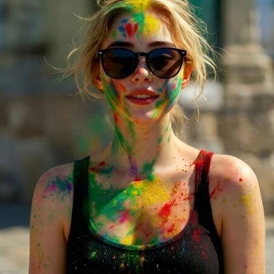
Three styles, three expressions captured in a perfectly designed... staircase. Photos & Video made with AI (Nano Banana) Edit in InShot My own Idea, Style & Design Prompted & edited by me 👉 Subscribe for exclusive videos + photo sets (Content you won’t see on the main feed) Prompt I used: "Create a photorealistic, high-detail lifestyle photograph of three young women posing together on a modern wooden staircase inside a stylish contemporary home. Do not reference or resemble any real celebrity or public figure. 1. Subjects, hair, skin, expressions & poses: Woman on the left: young woman with fair skin, light blonde hair styled in a neat high ponytail with a few soft strands framing her face. She has natural facial features, subtle makeup, and a relaxed, friendly expression. She sits comfortably on a wooden stair with one arm raised casually toward her hair, looking toward the camera with a confident but natural smile. Woman in the center: young woman with fair skin and blonde hair pulled into a sleek ponytail. She has softly defined eyebrows, natural makeup, and a calm, composed expression while looking slightly toward the side. She stands or sits one step higher than the others, creating a layered composition. Woman on the right: young woman with fair skin and long copper-red hair gathered into a ponytail, with a few loose strands around her face. She has subtle freckles, natural makeup, and a relaxed expression. She sits sideways on a lower stair with one hand resting naturally on the step while looking toward the camera. Keep all three women anatomically natural and proportionate, with realistic hands, facial symmetry, hair strands, and natural posture. Their interaction should feel like a casual group photograph between friends. 2. Clothing & accessories: Left woman wears a green-and-black horizontally striped sleeveless summer dress with a simple elegant design, paired with a delicate gold necklace and small earrings. Center woman wears a navy-and-blue striped sleeveless dress with a clean contemporary design and minimal jewelry. Right woman wears a burgundy-and-black striped sleeveless dress, with subtle jewelry and visible decorative tattoo artwork on her upper arm. Use realistic fabric texture, stitching, folds, and natural draping. Keep the styling fashionable but tasteful and suitable for a casual lifestyle photograph. 3. Environment & lighting: Set the scene inside a bright, modern multi-level home with a distinctive wooden staircase, white structural beams, thin metal cable railings, and warm wooden steps. Include contemporary architectural details, glass panels, neutral walls, minimalist furniture, and subtle decorative elements in the background. Large windows allow soft daylight to enter the room. Use warm ambient interior illumination combined with natural daylight for a welcoming atmosphere. Create realistic shadows and gentle highlights across the subjects and staircase without excessive contrast. Background should have moderate depth-of-field blur while retaining enough architectural detail to establish the location. 4. Camera & visual style: Photorealistic editorial lifestyle photography. Shot on a 50mm full-frame lens, approximately f/2.8, with natural perspective and subtle background separation. Eye-level camera positioned slightly below the group to emphasize the staircase architecture while keeping faces clearly visible. Vertical portrait composition, approximately 4:5 aspect ratio. Natural skin texture, realistic hair detail, accurate fabric texture, physically realistic lighting, sharp facial details, and authentic photographic depth. Warm cinematic color grading with balanced skin tones, subtle contrast, gentle highlights, and natural saturation. High dynamic range, professional indoor photography, crisp focus on all three subjects, realistic depth of field, ultra-detailed, polished but not artificially airbrushed."show more
J⭕DIE
14,390 просмотров • 1 месяц назад
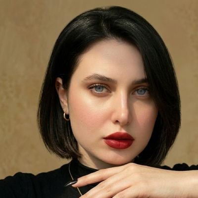
Here we go GPT Image 2 and Seedance 2.0... is now live on insMind #insmind #insmindai Generated this GRWM video using the Prompt : Aesthetic “Get Ready With Me – Gym Edition” storyboard layout, minimal neutral-toned design, soft beige and cream color palette, clean editorial grid. Top header text: “GET READY WITH ME” subtitle: “gym edition” in elegant script font subheading: “step-by-step activewear routine” The layout is divided into 4 blocks, each showing a sequence (1–8 steps per row), featuring the same young woman throughout with consistent face, natural makeup, athletic toned body, hair tied in a messy bun or sleek ponytail. BLOCK 1 – BASE (1–8) 1–2: putting on a fitted sports bra 3–4: wearing high-waisted gym leggings 5–6: adjusting waistband / smoothing fit 7–8: mirror check, relaxed confident pose BLOCK 2 – LAYERS (9–16) 1–2: putting on oversized gym t-shirt or cropped top 3–4: adding lightweight zip-up hoodie or jacket 5–6: tying hair tighter / adjusting outfit 7–8: slight movement pose (stretching arms or twisting body) BLOCK 3 – DETAILS (17–24) 1–2: wearing smartwatch / fitness band 3–4: adding minimal jewelry (thin chain, studs) 5–6: putting on gym gloves or lifting straps 7–8: wearing sunglasses or tying hair final look BLOCK 4 – FINISH (25–32) 1–2: putting on training shoes (clean white sneakers) 3–4: grabbing gym bag / water bottle 5–6: holding headphones / protein shaker 7–8: full-body mirror shot, confident final look Side icons representing categories: base, layers, accessories, shoes, final look. Soft natural lighting, indoor minimal room or modern apartment, neutral background, clean shadows, editorial fashion photography style, consistent framing across all panels. Footer text: “You’re ready. Go own your workout.” Video prompt : Use provided storyboard image as reference CONCEPT: Get Ready With Me — Gym Edition TIMELINE: 0 : 00–0:04 Sports bra on High-waisted leggings wear Waistband adjustment Mirror check 0 : 04–0:08 Oversized tee / cropped top Lightweight hoodie or jacket Hair tie (ponytail/bun) Light stretch / body turn 0: 08–0:12 Smartwatch / fitness band Minimal jewelry Gym gloves / lifting straps Sunglasses on 0: 12–0:15 Training shoes Grab gym bag + water bottle Headphones / shaker Walk-out + final confident look STYLE: Minimal, neutral tones, soft beige/grey palette, natural indoor lighting, clean modern interior, athletic aesthetic CAMERA: Close-up + mid shots, soft focus, shallow depth of field, steady framing, subtle handheld realism TRANSITIONS: Match cuts, outfit snap transitions, fabric motion cuts, quick clean jump cuts synced to movement OUTPUT: Loopable, smooth pacing, satisfying flow, social media ready (vertical 9 : 16show more
Smiling Khan
32,601 просмотров • 4 месяцев назад
Monthly WINR Protocol Development Update: To begin with, the... WINR Protocol has distributed $900,000 to token holders, generated more than $500,000 in pure profit for liquidity providers on WLP, acquired more than 5,000 users, and has almost 9% of the supply burned. In the upcoming months, the WINR Protocol, which has been in production for years, will introduce a range of new products and deployments. These developments will represent the practical and technical evolution to V2 of the protocol. Here are the latest updates and further details as they progress: Progress on WINR Bonanza, Casino Hold'em, and Blackjack is nearing completion. These games are in the final stages of testing. Additional games, including a new type of crash game, have been finalized and are set to debut with the JustBet v2 launch. Take a look at the gameplay videos for a preview. These games achieve the long-term goal of providing a full-suite WINR Game Engine SDK, which can be used to build games with complex logic on-chain with modular smart contract infrastructure. For example, any grid slot game that dominates the iGaming industry could easily be developed on-chain using the WINR Bonanza SDK. - Permissionless Frontend Operator SDK Dashboard Release: March is poised to be a milestone month with the launch of the Frontend Operator SDK dashboards. These dashboards will enable any WINR Labs game to be seamlessly deployed on frontends, marking a significant advancement in protocol accessibility and integration for future games developed by independent iGaming developers. The frontend operator can deploy any game they choose through a few simple steps while utilizing 10,000 WINR per game via the WINR Game Factory smart contract. Each operator is assigned a unique smart contract address(es) for every game they deploy, allowing their revenue to be tracked independently. The deployment process includes instructions on integrating the game as a package into the operator's frontend. In subsequent phases, the games will transition through WINR Chain, streamlining user onboarding steps like wallet connection and token bridging to Arbitrum. This abstraction will make it easy for any web2/web3 platform on any chain to seamlessly integrate WINR-based games with just a few clicks. The new budget system changes how the revenue is calculated on the protocol and will see daylight with frontend operator, Solana, and Fantom deployments. This model was first tested with a lightweight version on and gave a lot of actionable feedback. Shifting from the existing bribe model, which in practice distributes almost half of the edge of the games in volume to WINR holders, the brand-new budget system checks the profitability of WLP. It distributes a larger part of the profit to game providers, frontend operators, and, most importantly, WINR holders. Any time a game's budget is in profit, a part of every loss is distributed to stakeholders. Here is an example: 1. The WINR Bonanza Game has a 10,000 budget for a frontend operator. 2. Let's assume the bet amount was $50, and Bonanza paid back $10 on that spin. That leaves $40 of pure profit. 3. This is distributed amongst 50% to WLP, 20% to frontend operators, 20% to WINR holders, and 10% to game providers. 4. To achieve this, V2 of WINR Liquidity Engine (WLP) will have a buffer for purchasing and selling, working in epochs to determine the above distribution and math. - Solana Deployment and Expansions: Solana audits are in their final phase, and frontend tests are ongoing. Solana launch will be alongside the V2 launch of @JustBetOfficial, with a chain switch available on the top bar. The VRF system WINR developed already is seeing requests from builders around the Solana ecosystem, and this will over time add an extra layer of income to the protocol. Solana's bankroll, at first, will be a lighter version of WLP but will inherit the above-mentioned budgeting system to generate income immediately upon launch. - Fantom Deployment and Expansions: Fantom's upcoming Sonic upgrade, with its 200ms finality and fast block production is a perfect chain for WINR Protocol to expand. Through the partnership with WINR Protocol will tap into a brand new user base on Fantom. The bankroll on Fantom will consist of FTM and stables. The launch is planned for late March or early April. This expansion aims to open up new markets and collaborations with fresh teams. which operates independently, will integrate a broad spectrum of WINR technologies, including WINR Account Abstraction, WINR VRF, and WINR games, marking a pivotal step in WINR Protocol’s journey of horizontal expansion. - XAI VRF Deployment Progress Update: The WINR Account Abstraction Wallet and WINR Verifiable Random Function (VRF) deployment on the XAI 🎮⛓️ is well underway, with the majority of the work completed. This step forward showcases WINR's expansion beyond gambling and trading, highlighting the protocol's adaptability and commitment to broadening decentralized services. The process to automize and permissionlessly let game developers start using WINR VRF by paying (and burning) fees in WINR will launch alongside WINR VRF deployment on XAI and expand to further chains to help DApp builders with the tooling they need. This process will work very similarly to frontend operators, where DApp builders will be able to easily deploy their VRF contract, pay the WINR fees, and enjoy the fastest random number generation transaction, as showcased on @JustBetOfficial for some time. - JustBet v2 Development Update: Set to launch in March, the last testing phase with long-time community members of JustBet V2 is underway. Boasting a completely refreshed look, JustBet v2 aims to captivate more users with its modern features, a significant upgrade from the classic JustBet designed in 2019. Expect dynamic animations and a user experience that rivals traditional web2 casinos, setting a new standard for online gambling platforms and serving once again as proof of concept for all the new WINR features and infrastructure set to launch over the coming months. As always, WINR Labs simultaneously develops protocol infrastructure and platform to best address the needs of one and only goal: horizontal expansion. Easter eggs: Upcoming Gitbook update with all the technical information of WINR V2. CEX listing. Detailed product pages on WINR web. Pyth competitions. WIP-4 and WIP-5 are ready to deploy. And an 🪂show more

WINR
37,919 просмотров • 2 лет назад
opus 5.5 is f*cking cracked at motion design this... entire video is code, 0 after effects im open sourcing the prompt template for these motion designs steal it to recreate these ↓ Ask me for: 8 to 12 UI states I want the shape to become (e.g. button, loader, player, slider, toggle, tabs, chart, command palette, toast), pure black and white or one accent color, and a royalty-free song around 120 BPM (e.g. Mixkit, free for commercial use). Dribbble-level UI motion. One shape, never cut: every state is the same element morphing its size, radius and color while its content swaps with a short blur. A cursor drives every change with real clicks and drags. Light warm-gray canvas, black and white components, one clean UI font (Geist). Springs everywhere, a tiny overshoot at most. The camera zooms so each state fills the frame. The last frame is the first frame, so it loops. Banned: bouncy easing, particle bursts, glows, gradients on UI chrome, mismatched icon strokes, dead time, anything that looks like a template. 120 BPM, 7 bars, something happens on every beat. Button → loader → check → dynamic island → music player with a play/pause morph → scrub the progress bar → it becomes a volume slider that stretches when dragged past max → a toggle flips on the beat → the knob becomes a liquid tab indicator → the tabs open into a chart that draws itself, with a tooltip on hover → it collapses into ⌘K → type to filter → enter → toast → back to the button. 1. One HTML file, square 1440x1440. Every style is computed from time inside seek(t): no CSS transitions, no timers, no state carried between frames. 2. Springs are closed-form step responses. A value that changes target many times is the sum of one spring per change, so it stays a pure function of time. 3. The tab indicator's two edges ride different springs, so the leading edge stretches ahead of the trailing one. Same trick for the toggle knob. 4. Drags are direct manipulation: while the cursor is held, the value is computed from its position. On release it springs back from wherever it was. 5. Analyze the song with numpy for the beat grid and start on a downbeat. Place every UI sound by its measured peak. 6. Render with Playwright: 4 subframes per frame, blended with ffmpeg tmix for motion blur at 60fps. 7. Render one frame per beat before the full render. Fix anything off the grid, cramped or hard to read. Never put will-change on anything the camera scales or the text renders blurry. Text that swaps inside a morphing container needs its own enter and exit timing or it overlaps. Make the last frame identical to the first, cursor position and speed included, or the loop stutters. Ask me for the inputs, then show me the state list on the beat grid before you write any code.show more

zero
751,298 просмотров • 1 день назад
**AI IMAGE PROMPT — NESCAFÉ CLASSIC CINEMATIC STORYBOARD** Generate... **one premium professional vertical storyboard in 9:16 format** for a **NESCAFÉ Classic commercial**, featuring **5 seamlessly connected cinematic scenes** presented as a single cohesive advertising composition. ### CREATIVE DIRECTION Create the visual language of a **premium global coffee campaign** with: * NESCAFÉ-inspired red-and-white brand aesthetic * Apple-inspired minimalist editorial composition * Luxury FMCG magazine advertising style * Clean white editorial background * Sophisticated NESCAFÉ red accents * Bold modern sans-serif typography * Generous negative space * Warm, rich coffee color grading * Elegant visual hierarchy * Photorealistic commercial photography * Premium cinematic lighting ### 5 CONNECTED CINEMATIC SCENES **SCENE 01 — MORNING BEGINNING** A beautifully designed modern kitchen at sunrise. Warm golden sunlight enters through a large window. A NESCAFÉ Classic jar sits elegantly on a spotless white countertop beside a premium ceramic coffee cup. Subtle steam rises from freshly prepared coffee. Calm, sophisticated morning atmosphere. **SCENE 02 — THE POUR** Cinematic macro close-up of rich, dark NESCAFÉ coffee being poured smoothly into the cup. Capture the swirling liquid, creamy texture, delicate steam and realistic reflections. Use dramatic slow-motion visual language and shallow depth of field. **SCENE 03 — THE FIRST SIP** A stylish person takes the first sip of freshly prepared NESCAFÉ coffee in a bright minimalist environment. Natural expression, relaxed confidence, warm sunlight and elegant lifestyle composition. Keep the coffee and emotional moment as the focal point. **SCENE 04 — MOMENT OF ENERGY** The same person transitions into a productive modern workspace, focused and inspired. The NESCAFÉ cup remains naturally visible on the desk. Warm sunlight, subtle cinematic depth, clean surroundings and sophisticated editorial framing communicate energy, focus and motivation. **SCENE 05 — HERO PRODUCT** A striking premium hero shot of the NESCAFÉ Classic jar beside the finished coffee cup against a pristine white background. Elegant steam rises from the cup. Subtle NESCAFÉ red graphic elements frame the composition. Crisp packaging details, realistic shadows, beautiful reflections and luxury commercial lighting create a memorable final frame. ### VISUAL STORY FLOW **MORNING → PREPARATION → FIRST SIP → ENERGY → HERO PRODUCT** Maintain **perfect visual continuity** across all five scenes: same NESCAFÉ Classic packaging, consistent red-and-white branding, warm coffee tones, lighting direction, environment style and cinematic color grading. ### TYPOGRAPHY Integrate minimal premium editorial typography without overcrowding the composition: **“START YOUR DAY.”** **“RICH COFFEE. FULL FLAVOR.”** **“MAKE THE MOMENT.”** Use bold contemporary sans-serif typography with precise spacing, clean alignment and sophisticated magazine-style placement. ### CAMERA & RENDERING Ultra-realistic commercial photography, cinematic 50mm lens, macro product shots, shallow depth of field, HDR, realistic reflections, natural steam, highly detailed coffee texture, crisp product focus, soft cinematic shadows, premium studio lighting, realistic materials, sophisticated composition, ultra-detailed 8K quality. ### FINAL LOOK The final image must look like a **high-end global advertising campaign storyboard**, combining minimalist editorial design with emotional coffee storytelling. Clean, luxurious, modern, photorealistic, sophisticated and highly polished. **Aspect Ratio: 9:16 vertical | Ultra HD | 8K | Premium FMCG Advertising**show more

MҽҽɾαႦ
12,858 просмотров • 27 дней назад
A WEB STUDIO CHARGES $35,000 FOR AN ANIMATED SITE.... THE SAME BUILD NOW COSTS $12 - CLAUDE CODE WRITES, HIGGSFIELD RENDERS. Every agency billing $100-149/hr is just three departments. Here's each one, collapsed into a single agentic session. SYSTEM 1 - THE MOTION STUDIO (Higgsfield) Cinematic clips pulled from 30+ generative models - hero shots, transitions, ambient loops. → This used to be a motion artist on retainer. Now it's a prompt. SYSTEM 2 - THE DEV TEAM (Claude Code) Scaffolds the site, writes the GSAP ScrollTrigger timelines and Lenis smooth-scroll, extracts frames, optimizes every asset. → A full scroll-driven build with zero hand-coded keyframes. SYSTEM 3 - THE DESIGN DEPT (baked-in cinematic layer) Six effects with no config: film grain, particles, vignette, glass cards, color tints, scroll pacing. → The polish that justified the invoice - now it ships by default. Three departments. One operator. One pass. What used to take a designer, a motion artist, and a developer through weeks of handoffs now runs in a single session - for a Claude subscription and a few dollars of Higgsfield credits. The studio was never the talent. It was the overhead. And the overhead just became three systems. Reply "web-site" to this post and I will send you the step-by-step Playbook 👇show more

ZEUS⚡️
174,814 просмотров • 2 месяцев назад
Look at these photos Falcon 9 soaring into the... sky. Falcon Heavy and Starship ready for the next mission. Starlink antennas simple, clean, ready for any terrain. The Boring Company’s machine that looks like industrial sculpture. Futuristic tunnels full of Teslas. And the man whose vision stands behind it all. It’s not a coincidence. It’s not just “technology.” It’s class itself. Zero unnecessary ornaments. Zero exaggeration. Just a pure, very high-quality product. You hold it in your hand, step inside, or look at it and immediately feel that everything is refined to the last detail. It works. It looks right. It lasts. Elon Musk has this rare quality: he’s a man with class. He doesn’t flaunt luxury or add things just “because they photograph well.” He chooses simplicity but the kind that’s executed perfectly. And he transferred exactly that same philosophy to his companies. The result? Engineering at the level of fashion. Design that’s modern yet has timeless elegance. Products that don’t just do the job they impress with their quality and quiet confidence. It’s no accident that the rocket looks like a work of art. That a Tesla interior feels minimalist yet luxurious. That a Starlink dish looks like it was designed by someone who understands aesthetics, not just connectivity. They all share one common thread: class. Not the loud, flashy kind. The real kind quiet, self-assured, and uncompromising. If you value things that are simply well-made without unnecessary bling, but full of character and top-tier quality this is the essence of what Elon has built. Elon Musk Starlink The Boring Company SpaceX Tesla Neuralinkshow more

Natalia El Ferrara
412,617 просмотров • 2 месяцев назад