Загрузка видео...
Не удалось загрузить видео
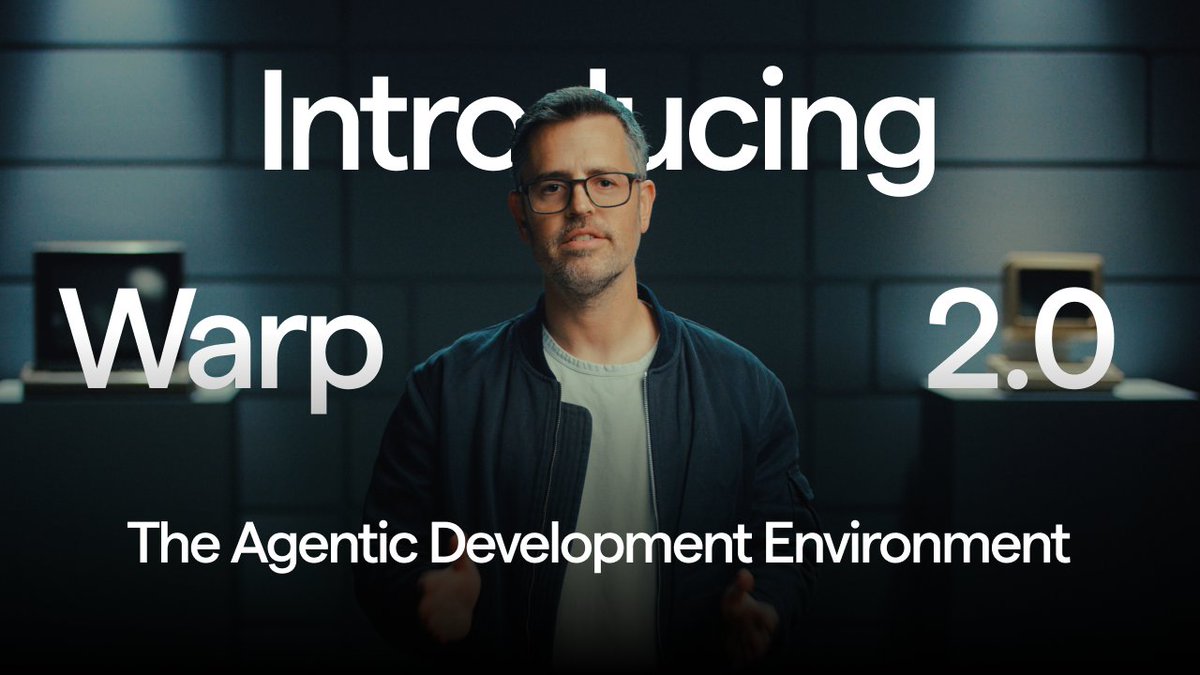
1. using Warp / Warp didn’t just code. It cooked. ✅ Agentic development environment ✅ Built-in coding agents with guardrails ✅ Multithreaded tasks & knowledge base One of the smartest coding tools I’ve tested. Rating: 10/10

39,685 просмотров • 1 год назад •via X (Twitter)
Комментарии: 9

Everyone says AI coding will replace you. So I ran a brutal experiment. Some shocked me. Some flopped badly. Thread with prompt + results: 🧵
2. using @FactoryAI Factory gave me an army of “Droids” to clear my backlog while I grabbed coffee. ✅ Delegates tasks end-to-end (PRs, tickets, docs) ✅ Handles incidents & root cause fixes ✅ Parallel agents = faster shipping Feels like scaling myself x10. Rating: 9/10
3. using @Firebase Easily the roughest experience so far. ✅ UI looks decent ❌ Took 3 hours to get running ❌ Tons of errors, laggy responses Not impressed. Hope they improve soon. Rating: 2/10
4. using @windsurf_ai Windsurf turned prompts into clean, organized tasks and the new Plan feature is wild. ✅ Simple Kanban board ✅ Smooth prompt-to-code workflow ✅ Easy to track progress Solid tool, neat experience overall. Rating: 8/10
Prompt: Design a futuristic, visually stunning project management workspace — a modern reimagining of Notion, Linear, and Asana, crafted for product teams and startup founders. It should present tasks, roadmaps, sprints, and progress insights with fluid, real-time interactions and cinematic transitions. The interface should merge the calm clarity of Linear with the depth and fluidity of Apple Vision Pro. Use a muted dark-mode foundation (#0E1117) accented with vibrant gradients (neon teal, soft magenta, cyber yellow) and translucent glassmorphism overlays on modals and pop-ups. Every component should animate thoughtfully: kanban cards slide into place, progress rings fill smoothly, timelines extend with elastic drag, and status updates trigger satisfying micro-interactions. Enable rich hover and tap feedback: cards gently lift, inline edit fields glow subtly, and popover menus expand with spring animations. Navigation stays minimal — a sleek sidebar with only essential icons and smart collapsible labels on hover. Typography should lean modern and clean: use Satoshi, Geist, or Space Grotesk with bold, readable headers (26–30px) and crisp, understated sublabels with subtle neon accents. Cards and modals use soft shadows, rounded edges, and clear hierarchy to avoid clutter. Core views: Dashboard: high-level project overview, team capacity, and sprint burndown Kanban Board: tasks by status, with drag-and-drop and inline editing Timeline: roadmap Gantt chart with milestones and dependencies Docs & Notes: collaborative, AI-summarized project notes and briefs Insights: velocity trends, blocker alerts, and delivery forecasts Everything should feel dynamic and alive — motion design blending seamlessly with productivity. It’s a project manager’s cockpit for an AI-native, visually demanding generation.
Which one was your favorite?

@warpdotdev Warp just raised the bar for dev tools. Feels like the future of coding is already here.

@warpdotdev Definitely a game-changer for dev workflows.

@warpdotdev Just tried warp and was really disappointed. The UI is confusing and for some reasons the diffs it shows you have the whole file and there's no indication of how many changes it made so you have to scroll through everything. Also couldn't exclude a folder from the codebase index