Sensitive content

This media may contain sensitive content.

Video yükleniyor...

Video Yüklenemedi

Ana Sayfaya Dön

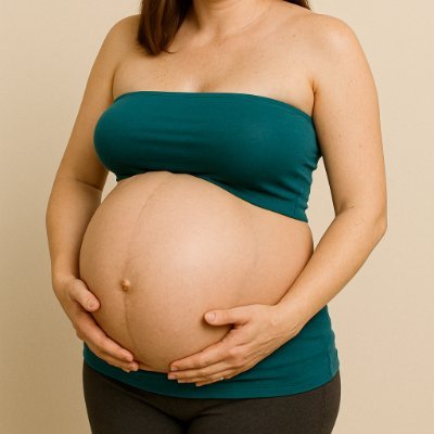
3D Animation: C-Section (Cesarean) Delivery These animations are commonly used for medical education, parent preparation, and healthcare training because they clearly show each step without real-life surgical footage.
93,499 görüntüleme • 7 ay önce •via X (Twitter)

0 Yorum

Yorum bulunmuyor

Orijinal gönderinin yorumları burada görünecek

Benzer Videolar

Truly stunning! The 300-bed Enugu International Hospital is nearing completion. The super-specialist referral hospital is now equipped with world-class, state-of-the-art medical infrastructure designed to meet global standards of healthcare delivery. The installed facilities feature advanced clinical and diagnostic units, including 3 fully equipped Intensive Care Unit (ICU) suites, a cardiac critical unit (CCU), 4 modern operating theatres, cardiac catheterization laboratory (cath lab), recovery unit, physiotherapy and rehabilitation centre, endoscopy suite, and comprehensive radiology department with CT scan, MRI, mammography, and other imaging systems. It also includes a fully equipped laboratory, modern pharmacy, blood bank, and a dialysis unit with 6 dialysis machines, dental and optometry units, cesarean section (C-section) unit, as well as outpatient and inpatient departments. The advanced oncology center is not left out. In addition, every ward and patient room is integrated with concealed medical gas pipeline systems supplying oxygen, medical vacuum (suction), and compressed air, alongside reliable electrical and nurse-call systems to ensure efficient and continuous patient monitoring and care. Support and service units such as sterilization (CSSD), medical records, ambulance services, laundry, housekeeping, and biomedical engineering are also incorporated to ensure seamless hospital operations and strict adherence to global healthcare standards. This signature project stands as a sturdy testament to the visionary leadership and reform-driven governance of Governor Peter Mbah, whose administration continues to prioritize healthcare transformation and the establishment of world-class medical infrastructure in Enugu State, positioning it as a hub for medical tourism. Tomorrow is indeed here!

Dan Nwomeh

14,348 görüntüleme • 4 ay önce

CSS Trick 🍏 You can create that Apple-style blowout text effect with CSS scroll animations and fixed positioning ⚡️ .word { animation: blowout; animation-timeline: --section; } @​keyframes blowout { 0%, 95% { background: transparent; } to { transform: translateZ(99vh); background: #000; } } The trick here is to fix the position of some things in your layout and then animate them based on their non-fixed containers ⭐️ The .word is position: fixed within a that has a height of 200vh section { view-timeline: --section; } section:first-of-type { height: 200vh; } Every section has a view-timeline: --section that creates a scoped ViewTimeline for each section's children 🤙 As that first section scrolls out of view, you increase its opacity and move it on the z-axis towards you. That gives it the impression of scaling up 🆙 .word { animation: blowout, fade-in; animation-timing-function: ease-in; animation-fill-mode: both; animation-timeline: --section; animation-range: exit-crossing 10% exit 0%; } You can use the exit-crossing range combined with the exit range to get a timing you like ✨ Definitely experiment with these ranges to see how they play. The timing function creates interesting effects too! At the same time as the text scales up, you need to fade in the video and the text that goes with it. Again, you can use the parent container's ViewTimeline --section p, video { animation: fade-in, fade-out; animation-timing-function: ease-in; animation-fill-mode: both; animation-timeline: --section; } p { animation-range: entry 10% entry 35%, exit 0% exit 25%; } video { animation-range: entry 0% entry 25%, exit 10% exit 35%; } The timings are slightly different here. Again, you can play with them to get something that feels right for you! @​keyframes fade-in { to { opacity: 1; }} @​keyframes fade-out { to { opacity: 0; }} Theoretically, you should be able to do something with animation-direction: reverse/alternate like yesterday's demo video { animation: fade 2 both linear alternate-reverse; } The trick with this effect is all about timing and creating containers that are bigger than the content and using them to drive the animations 🏎️ The scroll-driven signature is a bonus! ✍️ Perhaps a follow-up on that one 🤙 As always, any questions, requests, etc. Hit me up! With this demo, the GreenSock ScrollTrigger code is included where the CSS scroll-driven animations API is not supported 🙌 That means you could use this demo today! CodePen.IO link below! 👇

jhey ʕ•ᴥ•ʔ

270,144 görüntüleme • 2 yıl önce