Loading video...
Video Failed to Load
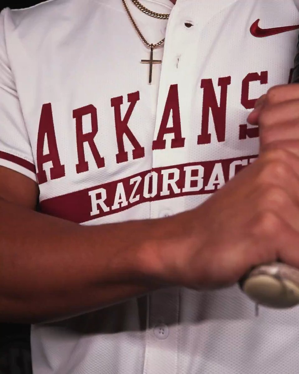
A modern take on a timeless classic.

8 Comments

honest braves fan 🇲🇽3 years ago
this is just a redesign of our retro uniforms

Walker 🐶🪓3 years ago
Hat is nice, uniform is mid imo

Bill Buttlicker3 years ago
@MLB would've been cooler to tie the native American history into the jersey, since they are called the 'Braves'

Gambit Sports3 years ago
@MLB The “Keep Swinging” under the bill of the hat goes kinda hard

dex+3 years ago
People not liking these should understand the club had to go this way because MLB/Nike is capping team jersey sets at 4+a city connect. White, gray, red, blue, puts us at 4. So the throwback got cut unless it was incorporated into city connect.

LC ࿋3 years ago
Nike really slapped “The” beside the A and called it a day

Neil Shelat3 years ago
#KeepSwinging needs to be the motto of the season!!!

Christopher✏️3 years ago
You’ve ruined it.