Video wird geladen...

Video konnte nicht geladen werden

Zur Startseite

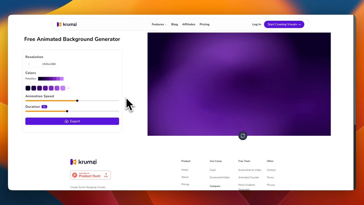
Create this gradient background❄️. In under-1min⏰.

23,198 Aufrufe • vor 4 Monaten •via X (Twitter)

0 Kommentare

Keine Kommentare verfügbar

Kommentare vom Original-Post werden hier angezeigt

Ähnliche Videos

CSS Trick! 🤙 You can create gradient borders on translucent elements using mask-clip and mask-composite with a pseudo-element 🔥 .gradient-border::after { mask-clip: padding-box, border-box; mask-composite: intersect; mask: linear-gradient(transparent, transparent), linear-gradient(white, white); } It's the same "Transparent border trick" from before. But, now you apply it to a pseudo-element 😎 The trick is to create a pseudo-element with a gradient background and then mask it so we only see the part we want, the border ✨ mask-clip defines the area affected by a mask. Similar to how you can define background-size. Using padding-box and border-box constrains the two masks. mask-composite is the magic part ✨ It defines a compositing operation for stacked mask layers. Using intersect means that the parts that overlap get replaced. And this seems to work in all browsers 🙌 As for the rest of the styles... – Make sure you set pointer-events: none on the pseudo-element – Make sure it fills the parent element. You can use position: absolute and inset: 0 – Make sure the background fills the space including the border-width. You can use calc to achieve that: --bg-size: calc(100% + (2px * var(--border))); background: var(--gradient) center center / var(--bg-size) var(--bg-size); That's it! 🚀 Gradient borders on translucent elements. You can set all the backdrop-filter: blur() you like! 😅 CodePen.IO link below! 👇

jhey ʕ•ᴥ•ʔ

269,739 Aufrufe • vor 2 Jahren