Video yükleniyor...

Video Yüklenemedi

Ana Sayfaya Dön

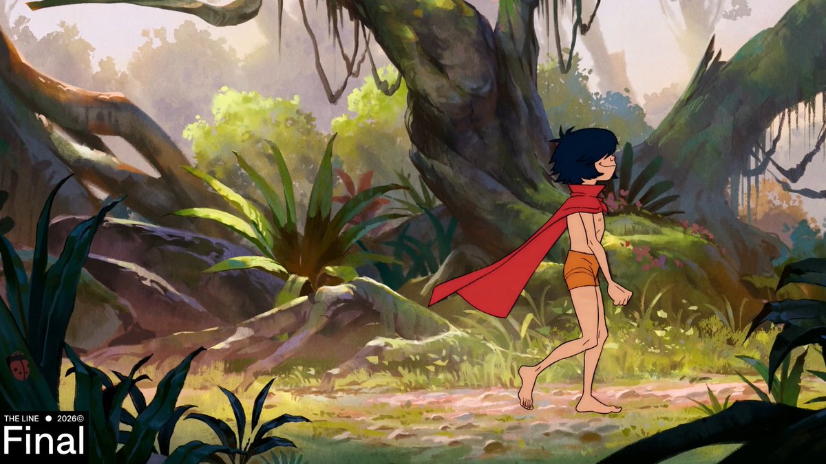
How does an animation pro use reference footage? 🤔💭📼 Alexis Wanneroy (Animation Supervisor at Fortiche) talks about his workflow from reference to final polish! ✨ Want to try this method yourself? Tag us - we’d love to see what you’re working on! #agoracommunity #animation

20,579 görüntüleme • 9 ay önce •via X (Twitter)

0 Yorum

Yorum bulunmuyor

Orijinal gönderinin yorumları burada görünecek

Benzer Videolar

𝙂𝙞𝙜𝙖 𝘽𝙖𝙚𝙡𝙯 | 𝙃𝙤𝙡𝙤𝙡𝙞𝙫𝙚 𝙂𝙞𝙖𝙣𝙩𝙚𝙨𝙨 𝘼𝙣𝙞𝙢𝙖𝙩𝙞𝙤𝙣 ---------------------------------------------------- After months working this animation from June to September, and a lot of delays. The animation is finally here, with some better upgrades and making a better animation with some details I decided to give. Plus, there's a greenscreen scene that I wanted to experiment but someday I'll explain the whole thing what is wrong that I feel like... bad for it. But, I hope this is worth it to experiment with this animation, and the greenscreen. Which someday in the future, I'll be making better of greenscreen so, stay tune for this. And thank you guys, for your patience and supporting me to make this animation as possible. Also, support me on P-site, to see my whole works that I do of renders I post in there. ---------------------------------------------------- CREDITS AND STUFF Animation Directed by: ChibuProduction3D. Storyboard by: ChibuProduction3D. Audio Composed by: ChibuProduction3D. Assets and Sounds SFX used from GTS Pack by: @/RensGts Animation made with Blender 4.4.3 LTS. ChibuProduction as myself (for the IRL Scene). Music Used on the Ending: Tifa's Theme - FINAL FANTASY VII (Composed by Nobuo Uematsu). Greenscreen Camera Assistant Recording and Filmed by: BlukDen ---------------------------------------------------- #SizeTwitter #giantess #巨女

ChibuProduction3D EN/LATAM (Comms Open)

15,048 görüntüleme • 8 ay önce

CSS Tip! 🐳 You can add little details like this scale down on scroll effect with scroll-driven animations and some sticky positioning 🤙 section { animation: scale-down; animation-timeline: view(); animation-range: exit; } @​keyframes scale-down { to { scale 0.8; } ] In this smaller example, you can lean into using the position to drive an animation that scales itself down as it leaves the viewport (Seen on the Apple Vision Pro site 🍏) The nice thing here is that if you don't have scroll-driven animations, the user still gets a good experience ✨ So how do you do it? There isn't much to it header { transform-origin: 50% 0%; animation: scale-down both ease-in; animation-timeline: view(); animation-range: exit; view-timeline: --header; } @​keyframes scale-down { to { scale: 0.8 0.8; } } That's it. The layout makes use of position: sticky so that the element stays in the shot whilst you scroll the page. As it leaves the page, it scales down inside the 🫶 The other smol animation here is fading the overlay on the video out 😎 Real easy. You may notice the view-timeline you defined above for the 👀 header { view-timeline: --header; } You have a pseudoelement on the text content of the header that lives inside a header > section::before { background: hsl(0 0% 0% / 0.75); opacity: 1; animation: fade both linear; animation-timeline: --header; animation-range: exit-crossing 0% exit 0%; } @​keyframes fade { to { opacity: 0; } } You use a slightly smaller range on this with exit-crossing to fade it out before you start the scale down animation 🤏 That's it! Thought this smaller example would be easier to grok for people 🙏 It's also covered with JavaScript if you really want it for your sites 🤙 CodePen.IO link below 👇

jhey ʕ•ᴥ•ʔ

146,270 görüntüleme • 2 yıl önce

CSS Tip! ✨ You can create these parallax effects and image cross-fades with scroll-driven animations 🤙 img { animation: fade; animation-timeline: view(); mix-blend-mode: plus-lighter } img:last-of-type { animation-direction: reverse; } @​keyframes fade { to { opacity: 0; }} This one's fun! 😁 The trick with the cross-fading image is to make use of one animation that runs at the same time on two images inside a container. You use the same animation, animation-timeline, and animation-range. But, you use animation-direction: reverse on one of the images so they go in the opposite direction 🫶 The use of mix-blend-mode: plus-lighter; produces a better cross-fade result 💯 A viewTimeline (view()) works because you know that both images are the same height. The range you can use is img { animation-timeline: view(); animation-range: cover 45% cover 55%; } That means when the image has covered 45% of the scrollport (In this case, the window), start the animation. And finish when it has covered 55% 🎬 How about the slight parallax? This is a trick with calc(). You know the top of the small image and the big image line up. And you can do this by absolutely placing the caption outside of the small image. The trick is to translate the small image by a distance so it lines up with the bottom of the big image. You can do that like this :root { --catch-up: calc( var(--big-height) - var(--small-height) ); } @​keyframes move { to { translate: 0 var(--catch-up); }} Then drive that animation with a scroll-driven animation using the container of both images as the driver 🤙 /* section contains both images */ section { view-timeline: --container; } .img-fader { animation: catch-up both linear; animation-timeline: --container; animation-range: 50vh calc(100vh + (var(--big-height) * 0.25)); } That's it! Scroll-driven image cross-fading and parallax effects without any JavaScript. This demo will work in all browsers as there is some JavaScript in place where the API isn't supported 🤙 To do that, it uses GSAP ScrollTrigger 🏆 As always, any questions, requests, etc. hit me up! 🤙 CodePen.IO link below 👇

jhey ʕ•ᴥ•ʔ

242,074 görüntüleme • 2 yıl önce