Загрузка видео...
Не удалось загрузить видео
ホワイトバランスやセル画の色を考えるとだいたいこんな感じの色になるはず。今の公式のマスターは赤すぎ。
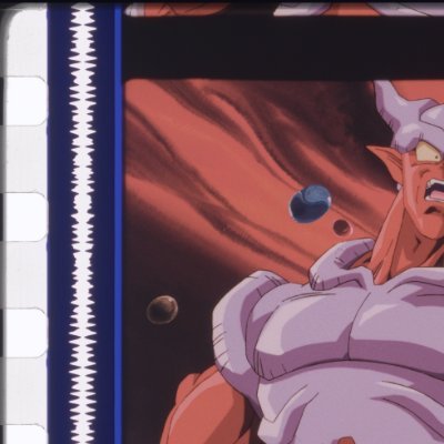
12,705,138 просмотров • 2 лет назад •via X (Twitter)
Комментарии: 10

Resolveのスチルを置いておくのでDVDの映像を自分で弄りたい人はどうぞ。第1話Aパートにしか合わせてません。
This is the Latin American video master transferred way before the film turned into a faded mess. It's not pink at all, and this is how kids back then were introduced to the show. The pink tint shouldn't represent "nostalgia." It's nothing but a Mandela effect.
Here's a comparison between the 2000s JP DVD and the '90s LaserDisc release
"But the pink tone gives an iconic dreamy, girly vibe to it!" Yeah, DBZ is a dreamy girly show. Confirmed.

The pink tinge enriches all the color and is a genuine improvement. Happy accident
No, it just washes away the vibrant, pop cel colors it was supposed to have.

The pink makes everything more girly so it fits
@smuggyoza Made it extra girly for ya Hope you'll enjoy this authentic '90s anime aesthetic 100% intended by the original creators

Nah sorry the pink tint is iconic
It's something YOU find iconic.


![クリスタのラスターレイヤーで線の太さ&色を一気に変える方法です 線の太さは フィルター→線画修正→線幅修正 線の色は 変えたい色を選んで[編集]→[線の色を描画色に変更]で変更できます ただラスターはかなり線が細くなりやすいので少し注意を〜。ご参考になれば #CLIPSTUDIO](https://image.24vids.com/tw-1651177610288975873/amplify_video_thumb/1651177228544380928/img/7NZ3YTRIu9irugwV.jpg)


