Video wird geladen...

Video konnte nicht geladen werden

Zur Startseite

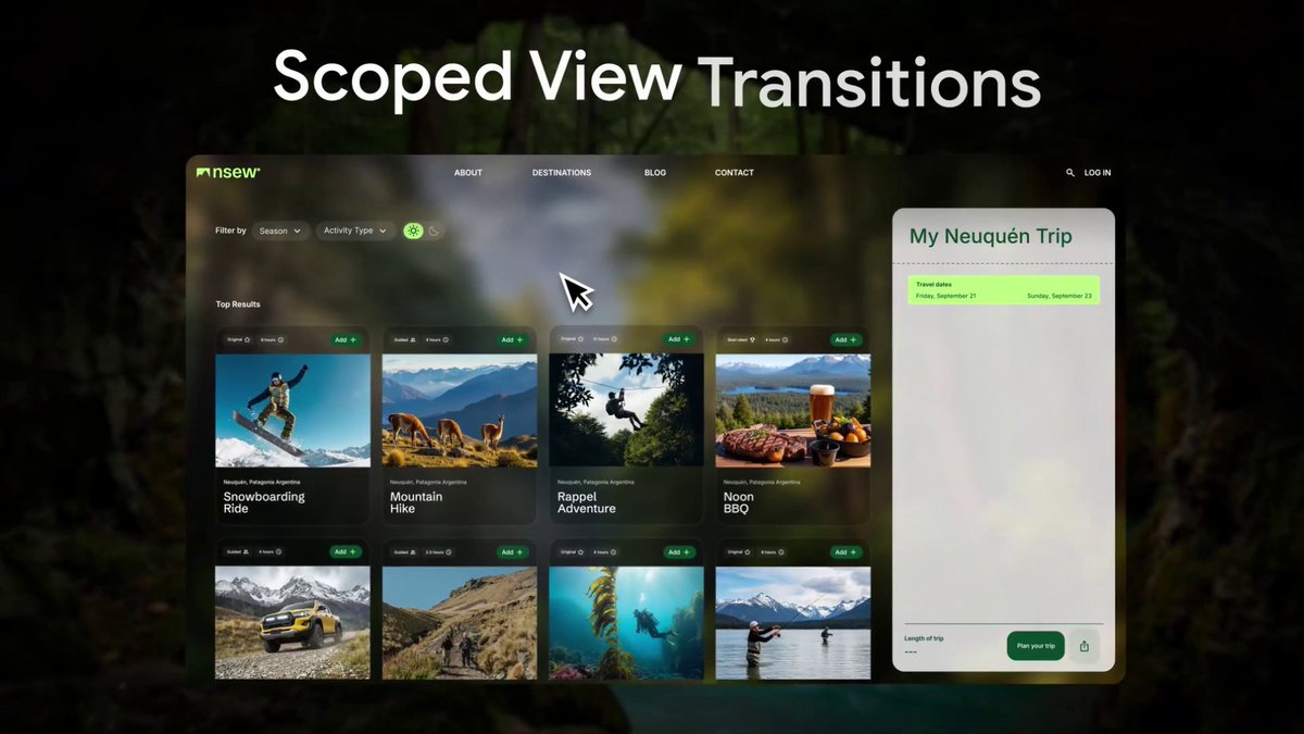
#CSS only full URL page navigation with View Transitions - 5 minute prototype - 1 meta tag - a few lines of CSS - Open Props Behind a flag in Canary: chrome://flags/#view-transition-on-navigation It's not finished yet, but there's really rad opportunities already available 🤓

30,454 Aufrufe • vor 3 Jahren •via X (Twitter)

10 Kommentare

Profilbild von Adam Argyle
Adam Argylevor 3 Jahren

new page scales += fades in old page quickly scales += fades out that's it. and there's way more customization you can do, this is basic!

Profilbild von 🍊 KIRUPA
🍊 KIRUPAvor 3 Jahren

Really cool. Is this for multi-page navigation? 🔥

Profilbild von Adam Argyle
Adam Argylevor 3 Jahren

yep!

Profilbild von Dave Geddes
Dave Geddesvor 3 Jahren

this is going to be super cool

Profilbild von Alex Casillas —アレックス
Alex Casillas —アレックスvor 3 Jahren

WOW 🤩 This is really cool ❤️

Profilbild von Luky - A$AP Luky
Luky - A$AP Lukyvor 3 Jahren

Damn! Looking stellar! I need to check this out with care!

Profilbild von Craig Webb
Craig Webbvor 3 Jahren

Thank you Adam for all you do

Profilbild von real007
real007vor 3 Jahren

How come it's taking 3.4s for the view to change when the user clicks on some things?

Profilbild von Adam Argyle
Adam Argylevor 3 Jahren

@MrH26750794 They're still working on things

Profilbild von César Gómez
César Gómezvor 3 Jahren

@SaveToNotion #thread #css #animation #viewtransitionsapi

Ähnliche Videos

CSS in 2024 🤯 You can create a range slider with updating value tooltip and color changing track without using any JavaScript 🤯 ::-webkit-slider-thumb{ view-timeline: --thumb inline; } Scroll animation on the slider thumb that animates a number between the "min" and "max" of the range 😅 @​property --value { syntax: ' '; } @​keyframes sync { to { --value: 100; }} Tie that up to the contain animation-range ⚡️ .control { animation: sync both linear reverse; animation-timeline: --thumb; animation-range: contain; } Hoist the view timeline so the tooltip can use the value too! :root { timeline-scope: --thumb; } Then use it in the counter which goes in the tooltip 😇 .tooltip { counter-reset: val var(--value); } .tooltip::after { content: counter(val); } Then the accent color is based on the value too 🎨 [type=range] { accent-color: hsl(var(--value) 90% 65%); } The magic from the quoted post is using anchor positioning on the range thumb to position that tooltip 👏 Never thought of that when working on the spec for this API. This API lets you tether elements to other elements. Using the pseudo is a clever move! ::-webkit-slider-thumb { anchor-name: --thumb; } .tooltip { position: absolute; anchor-default: --thumb; left: anchor(50%); bottom: calc(anchor(top) + 25%); } The last piece is the little bounce transition... OK. I used a line or two of JavaScript for that 🙏😬 const updateDelta = ({ movementX }) => { document​.documentElement​.style.setProperty('--delta-x', movementX) } document.body.addEventListener('pointermove', updateDelta) But only so you can pass the movement delta to CSS and then reset the position with linear() to get that bouncy transition 😎 .hint { rotate: calc(clamp(-60, var(--delta-x) * -1, 60) * 1deg); transition: rotate 1s linear( 0, 0.2178 2.1%, 1.1144 8.49%, ... ); } Should probably do a video on this one. Lots of little tricks to break down with it for sure! 💯 As always, any questions, let me know! Also, this one only works in Chrome Canary with the Experimental Web Platform Features flag enabled ✅ This one almost feels like rocket science ha 🚀 CodePen.IO link below! 👇

jhey ʕ•ᴥ•ʔ

251,867 Aufrufe • vor 2 Jahren

Future CSS Tip! 🍏 You can create this Apple-style photo scroller by combining CSS scroll-driven animations and CSS scroll-snap 😍 Peep those changing captions 👀 No JS! img { animation: highlight both linear; animation-timeline: view(inline); 👈 Horizontal animation-range: cover 0% cover 50%; 👈 Finish } @ keyframes highlight { 50% { translate: 0 0; scale: var(--starting-scale); 👈 props opacity: var(--starting-opacity); 👈 } 100% { translate: 0 0; scale: 1; opacity: 1; } } Without the animation support, you get a standard unordered list containing some s 🤙 How do we swap the captions though? The "trick" is to use position: absolute on the figcaption and animate their opacity based on the ViewTimeline of their parent list item 😎 figcaption { animation: show both linear; animation-timeline: --list-item; } @ keyframes show { 0%, 45%, 55%, 100% { opacity: 0; } 50% { opacity: 1; } } li { view-timeline-name: --list-item; view-timeline-axis: inline; 👈 important! } The parent of the scroll track uses position: relative so all the captions sit in the middle even though they are in the right place for the markup 🙌 The last bit is the scroll-snap 🤙 Not much to it at all. Wrap the list and make it scrollable. Then add scroll-snap-type .wrapper { scroll-snap-type: x mandatory; overflow-x: scroll; } Then make sure each list item has scroll-snap-align set on it li { scroll-snap-align: center; } That's it! Pretty cool demo to put together and see how to do this stuff with these APIs 🤓 A lot of cool little tricks to pick up for writing your CSS! ⭐️ CodePen.IO link below! 👇

jhey ʕ•ᴥ•ʔ

234,583 Aufrufe • vor 2 Jahren

CSS Trick 🧲 You can create magnetic links with the power of custom properties and some JavaScript 💪 a { translate: calc(clamp(-1, var(--x), 1) * var(--pad-x)) ...; transition: translate var(--s, 1s) var(--ease, var(--elastic)); } a:hover { --s: 0s; } The trick here is to pad out the list items wrapping your links and use that as a translation limit 🛑 Start by using some JavaScript to calculate a value between -1 and 1 for both the x/y axis on pointermove for each list item, not the link! 🔗 If your pointer was at the center of the item, you'd get [0,0]. If it was in the top right, you'd get [1,-1] ☝️ It's worth checking out the JavaScript snippet to see how the mapping function works. Essentially, you create a function that when given a value between two bounds, will give you a mapped value back 🤙 const mapX = mapRange( item.offsetWidth * -0.5, item.offsetWidth * 0.5, 1, -1 ) Then, on pointermove, you plug the pointer position in to get the value back out and pass that into your CSS const x = mapX(item.centerX - event.x) document​.documentElement​.style.setProperty(--x, x) When the pointer leaves the list item, you make sure to reset these values back to 0 ✨ Once CSS has your values, it's the trick of updating the translation of each part You know that in each axis, you only want to translate the link by the padding amount li a { translate: calc(clamp(-1, var(--x), 1) * var(--pad-x)) calc(clamp(-1, var(--y), 1) * var(--pad-y)); transition: translate var(--speed, 1s) var(--ease, var(--elastic)); } This will translate the link within the list item by the desired amount. The cool part here is that you can set an offset for the text inside the link and have that move at a different rate ⭐️ By only updating the --pad-x/y custom properties for the inside the link, you can control how much it moves nav a span { --pad-x: 0.25rem; --pad-y: 0.25rem; } And the last piece, how do you update the behavior for transition speeds? And so it springs back like that? Again, use custom properties ✨ a:hover { --s: 0s; } a { transition: translate var(--s, 1s) var(--ease, var(--elastic)); } By default, a link will use --elastic easing via linear() and have a transition-duration of 1s. When a link is hovered that speed becomes 0s because you want the link to magnetise to your pointer. How about that little gap between when your pointer enters the item but hasn't hovered the link? Set a different transition so it transitions to being hovered 🫶 nav li:hover a { --ease: ease-out; --speed: 0.1s; } That's kinda it! 🙌 Use JavaScript (~40 loc) to get the information and then let CSS do all the lifting for you 💪 Any questions or suggestions, let me know 🙏 If you want a walkthrough video, also let me know please 🙏 CodePen.IO link below 👇

jhey ʕ•ᴥ•ʔ

164,863 Aufrufe • vor 2 Jahren

Qullamaggie’s Episodic Pivot Concepts and Setups “Those are the best ones. The EPs that break a multi-month range or multi-quarter range. Focus on those. LCEP last earnings season. That was a five star. Came out of a four, five month consolidation on high volume. Start with earnings EPs. Those are easiest. Those are the brain dead ones. These biotech ones are very hard, especially micro nano caps. Forget about them. It's a waste of time. Yeah, exactly. Biotech and micro nano cap EPs are just excuses to dilute the company. They rarely work out. The fail rate is just so high. Yeah, guys, especially if you have a full-time job, the one thing you should be focusing on is EPs. You'll have probably half a dozen to a dozen perfect opportunities per earning season. 4 or 5 star opportunities. Not all of them are gonna work out, but the ones that will work out will go up hundreds and hundreds of percent. Yeah, well, EPs, yes. I mean, if it's a really good one, you can buy it, even if your stop is gonna be like, say, 1.5x the average true range, or ADR. Sometimes you kind of have to not chase it, but have a little bit of a wider stop, just because these things can make very big moves. You can still get, you know, 20, 30, 40, 50 times your risk reward out of them, out of the best ones. You don’t have to buy everything on the 1 minute opening range highs. You can buy stuff on the 5-minute breakout or a 60-minute breakout, as long as it hasn't gone up like enormous amounts since the first 1 and 5-minute breakouts. But most of the time you don't need to be the first one in. Let the stocks prove themselves.”

Lone

18,012 Aufrufe • vor 1 Jahr