Video wird geladen...
Video konnte nicht geladen werden
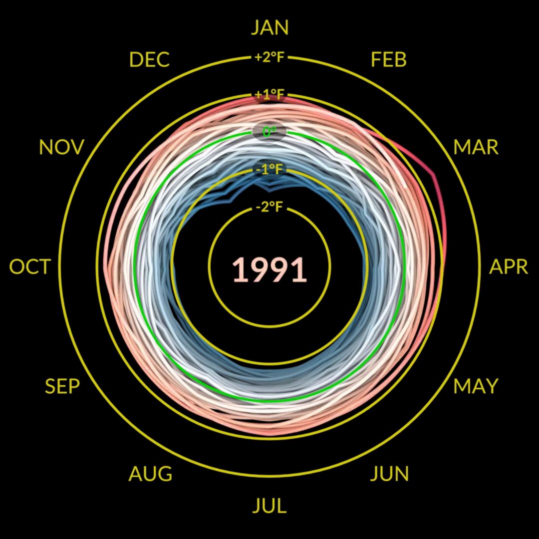
startling nasa visualization of climate anomalies from 1880-2022

231,450 Aufrufe • vor 3 Jahren •via X (Twitter)
8 Kommentare

Rohanvor 3 Jahren
This is an ingenious visualization, wow.

D’Shaun Maddeauxn Xvor 3 Jahren
when it’s a big enough of a problem, we will adopt widescale nuclear energy. Otherwise, it’s noise

Motirollavor 3 Jahren
1 degree in 140 years, run to the hills.

Charles Morganvor 3 Jahren
Looks cool. Just for comparison, can you show the 100 years before that? Would be nice to see how much cooler the climate was back then.

Kate Johnsonvor 3 Jahren
Can you please share a link to the data source and methodology behind this visualization? Thanks.

Bruce Lundvor 3 Jahren
NASA had much better satellites after 1920.

Sam Doré Hallvor 3 Jahren
This is a good thing right? Right?!?

allavutvor 3 Jahren
Private jets should be outlawed.