Video wird geladen...
Video konnte nicht geladen werden
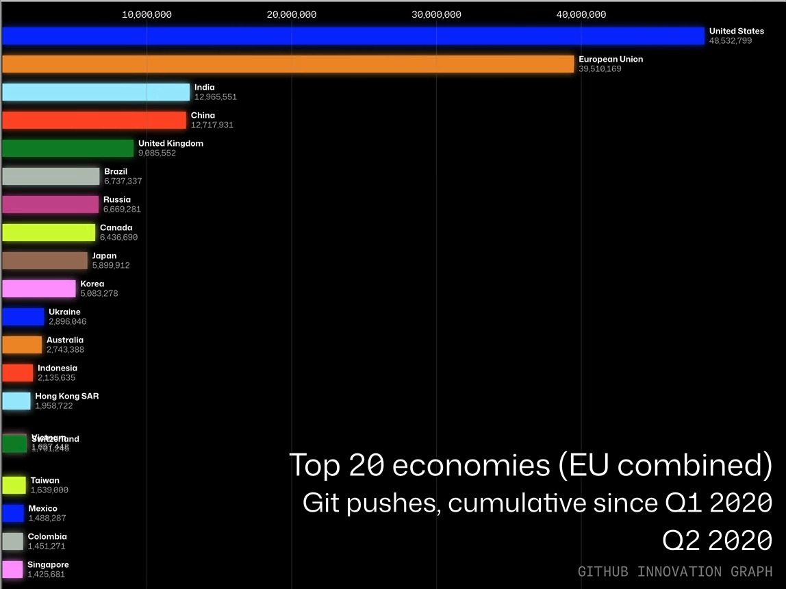
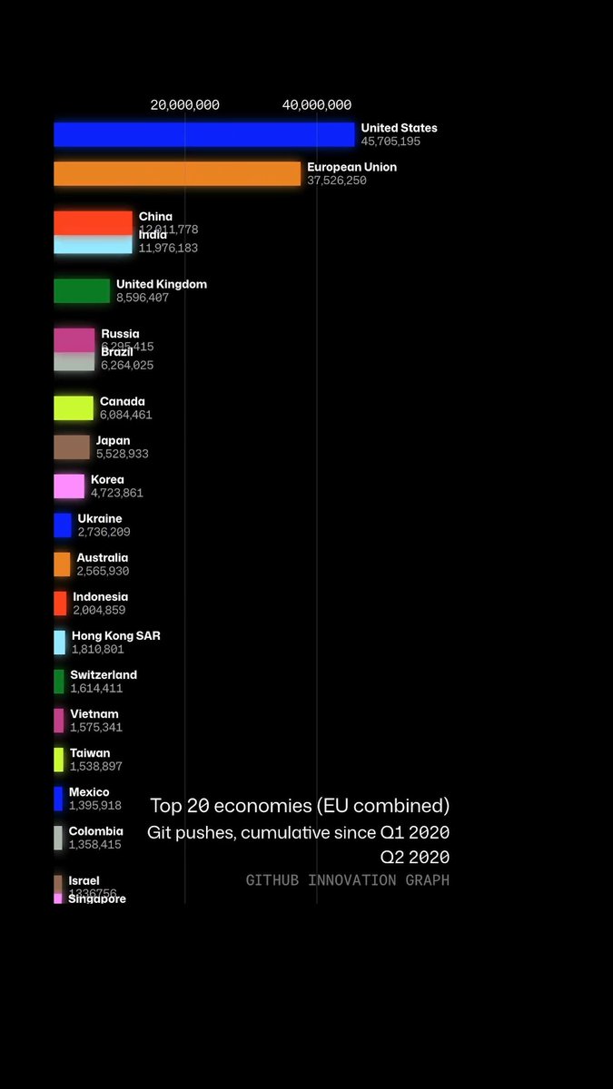
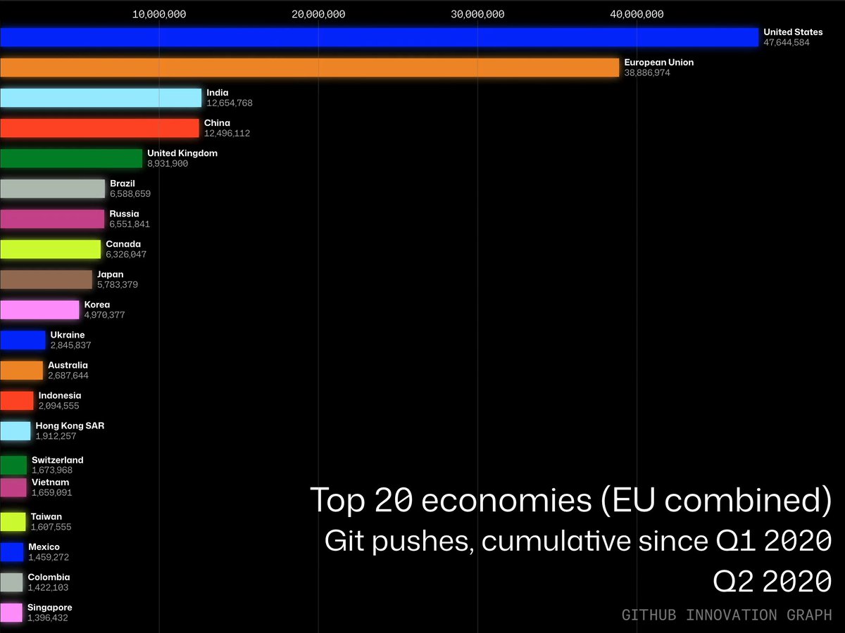
The GitHub Innovation Graph is fun to watch (who doesn't love a bar race? 🏁) but it's also a source of compelling economic data. It's helping researchers reveal trends in GDP, inequality, and emissions that traditional indicators miss. Find out how. 💡

54,260 Aufrufe • vor 3 Monaten •via X (Twitter)
0 Kommentare
Keine Kommentare verfügbar
Kommentare vom Original-Post werden hier angezeigt