Video wird geladen...

Video konnte nicht geladen werden

Zur Startseite

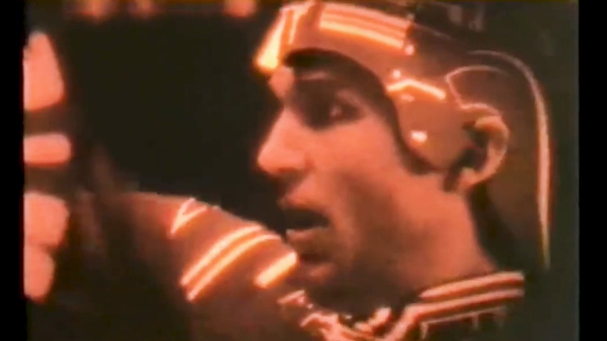
Back in 1990, Total Recall saw Arnold Schwarzenegger pull off a wild mask scene. With limited CGI, effects legend Rob Bottin achieved it the old-school way — using a heavy, practical prosthetic and mechanical mask. Movie magic, built by hand.
44,571 Aufrufe • vor 1 Monat •via X (Twitter)

0 Kommentare

Keine Kommentare verfügbar

Kommentare vom Original-Post werden hier angezeigt

Ähnliche Videos

CSS Trick! 🤙 You can create gradient borders on translucent elements using mask-clip and mask-composite with a pseudo-element 🔥 .gradient-border::after { mask-clip: padding-box, border-box; mask-composite: intersect; mask: linear-gradient(transparent, transparent), linear-gradient(white, white); } It's the same "Transparent border trick" from before. But, now you apply it to a pseudo-element 😎 The trick is to create a pseudo-element with a gradient background and then mask it so we only see the part we want, the border ✨ mask-clip defines the area affected by a mask. Similar to how you can define background-size. Using padding-box and border-box constrains the two masks. mask-composite is the magic part ✨ It defines a compositing operation for stacked mask layers. Using intersect means that the parts that overlap get replaced. And this seems to work in all browsers 🙌 As for the rest of the styles... – Make sure you set pointer-events: none on the pseudo-element – Make sure it fills the parent element. You can use position: absolute and inset: 0 – Make sure the background fills the space including the border-width. You can use calc to achieve that: --bg-size: calc(100% + (2px * var(--border))); background: var(--gradient) center center / var(--bg-size) var(--bg-size); That's it! 🚀 Gradient borders on translucent elements. You can set all the backdrop-filter: blur() you like! 😅 CodePen.IO link below! 👇

jhey ʕ•ᴥ•ʔ

269,847 Aufrufe • vor 2 Jahren

🎓Learn how to create a powerful Torn Fabric smart material in a matter of seconds in my latest video series (AAA) Pro Tips! This smart material can be used on virtually any 3D asset. ____________________________________________________ In this video, the steps are as follows: 1. Create a base fill layer containing no information. We will use this layer to call out the core effects. Add a black mask to this layer and inside that mask add a paint layer and draw a simple pill shape. 2. Next, add a blur directional and be sure the direction is the same direction that your fabric is flowing to. 3. Add a UV border generator set to subtract to mask out any uv seams followed by an anchorpoint. Additionally, add a messy Fibers 3 fill layer set to overlay. 4. Use a levels to adjust the mask along with a sharpen filter. A warp filter should also be added to introduce some randomness. Add an anchor point at the top of the mask as well. 5. Create another fill layer with its opacity channel set to black and apply a black mask to the fill layer. Inside its mask retrieve the anchorpoint information from the previous fill layer. 6. Create an additional fill layer with a bright diffuse color along with a black mask applied to it. Add the anchorpoint information from the previous mask into its mask as well and this should give us some white fibers on the edges. Now we have a torn fabric effect wherever we paint using the paint layer created inside the callout mask! ____________________________________________________ More AAA Game Dev Tips can be found on my YouTube channel here: Stay tuned for more weekly Tips! Happy Texturing!💚 #gamedev #gameart #tutorial #3dmodeling #hardsurface #texturing

Cohen Brawley

78,842 Aufrufe • vor 2 Jahren

007/100 Buttons. This button was way more complex than I first thought. I love the page transition on the Truus site that Dennis Snellenberg and Jordan Gilroy worked on. So I wanted to use that drawing SVG Path idea somehow and fit it into a button. In best case with a mask effect. The idea was to have an SVG path in the background that fills the button. At the same time, this path should also be used as a mask to reveal the differently colored text. The SVG should also be replaceable and work with other SVGs. For the path animation, I can use the DrawSVGPlugin from GSAP. Sounds like a solid plan. I built the button so far, and it worked great in Chrome and Firefox. In Safari, nope. I used an SVG mask that I referenced through CSS. But Safari can’t handle that properly when the path inside the mask is animated, so the animation lags. There was no simple solution for that. At least I didn’t find something. So I had to rebuild the button in another way. What I found was that the SVG mask animation works in Safari when the mask is placed on the desired element inside the SVG. That’s where foreignObject comes in, it allows you to use normal HTML elements inside an SVG. Using that, I rebuilt the hover text inside the SVG. I then referenced the mask on the foreignObject with a bit of JavaScript. And it worked! The button’s structure looks more complicated than I wanted it to be, but that happens quite often when you need to make something work across different browsers 😃 Crafting 100 Buttons with Osmo ⏳ Total time: 96h

Eduard Bodak

67,560 Aufrufe • vor 3 Monaten