Загрузка видео...
Не удалось загрузить видео
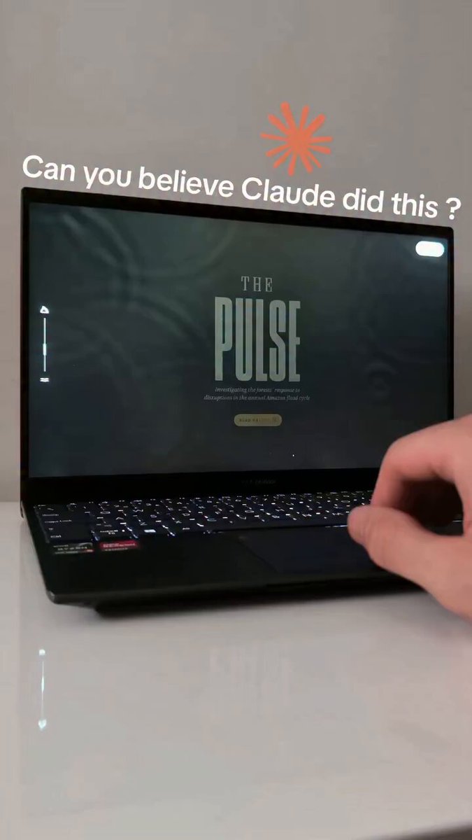
One line of CSS. Perfectly responsive typography on every screen. font-size: clamp(1rem, 1vw, 1.75rem); 🪄 1rem minimum keeps text readable on phones 🪄 1vw makes it scale fluidly with the viewport 🪄 1.75rem caps it elegantly on large displays No media queries or breakpoints. Try it!

193,045 просмотров • 3 месяцев назад •via X (Twitter)
Комментарии: 0
Нет доступных комментариев
Здесь появятся комментарии из оригинального поста


![Claude "Puzzling" while GPT 5.6 on GOD-MODE just bade a banger that's mindblowing. Here's the exact way to get a site like this, step by step: > open the desktop app, pick Sol, reasoning on High. taste work never goes to small models > drop it 3 sites with motion you love and one line: "reverse-engineer the art direction: mood, typography, pacing, and WHY each animation exists. save it as a style bible" > brief in one paragraph, goal not steps: "[your niche] site, cinematic scroll, every animation has a job. follow the bible" > house rules on top: no template hero, no stock gradients, nothing on the page moves without a reason > now the bar: "a motion designer can't tell this from an agency build." spin up a SECOND 5.6 with fresh context whose only job is to FAIL the build against that bar > /loop overnight: build, grade, close the biggest gap, again. you're asleep for all of it > when the verifier runs out of complaints: tag Sites. live URL, one click, zero hosting The deeper version of every step (the full contract, the house rules, the verifier trick, when Ultra is worth the bill) is in the article below. P.S. send the article to your GPT and tell it "we're doing this tonight".](https://image.24vids.com/tw-2077199463278395732/amplify_video_thumb/2077198329612521472/img/W1LLA__dexNvF_AY.jpg)


