Video wird geladen...
Video konnte nicht geladen werden
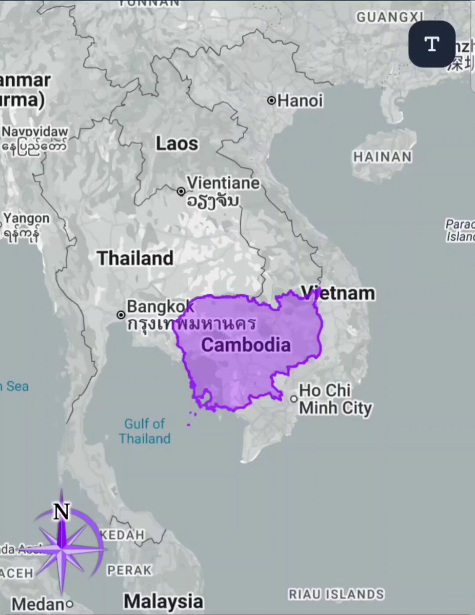
The true size of countries 📹 architecturediscuss

859,943 Aufrufe • vor 1 Jahr •via X (Twitter)
10 Kommentare

@P3H010314 What happened to Crimea there huh?

This should be the actual Map

Not many people realise just how BIG Africa is

It should look like this 🗺️

The classic world map known as Mercator projection is massively distorted and wrong compared to actual scale. It distorts size because it stretches latitudes, exaggerating areas more as we traverse near to the poles. It makes many countries appear larger

This is a result of the Mercator Projection. The Mercator projection is a cylindrical map projection that was developed by Gerardus Mercator in 1569, primarily for navigational purposes. It preserves angles and shapes but distorts the size of areas, especially as you move away from the equator, making regions like Greenland appear disproportionately large compared to regions near the equator like Africa.

The Mercator projection

The true size of countries can be misleading due to map projections that distort shapes and sizes. For instance, Greenland looks larger on traditional maps than it is compared to countries near the equator. The Peters projection offers a more accurate representation of land area, showing true country sizes and proportions.

Crimea is Ukraine

The place where Gravity is low in the World